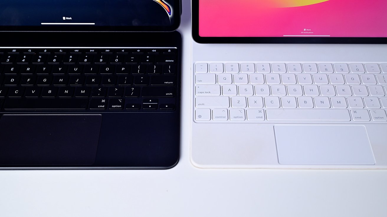
New Magic Keyboard [left], old Magic Keyboard [right]

Apple updated its Magic Keyboard accessory at the same time as the iPad Pro range. This is what’s updated in the new Magic Keyboard for iPad Pro over the previous version.
The Magic Keyboard for iPad Pro was a statement-making accessory for Apple’s premium tablet line. Magnetically holding onto the slate computer, it would hover the iPad Pro above the keyboard thanks to its floating cantilever design.
It’s also Apple’s first real upgrade to the accessory. Apple has made a few key changes made to it that improves the overall experience.
This is what Apple has updated in its new iPad Pro Magic Keyboard.
Magic Keyboard for iPad Pro comparison – Aluminum and covers
The original Magic Keyboard used a soft-touch material that was prone to showing finger prints and smears on the black model. The white version was also a quick collector of dirt, which spoiled the appearance.
The new version has the same soft-touch material on the outside. At a bare minimum, it’s wipe-clean like the original.
On the inside, things are different. The old material covering has gone, and has been replaced by an aluminum palm rest.
This is a change that dramatically changes the rigidity of the wrist rests, but also the appearance. When opened, the aluminum offers an aesthetic that’s somewhat resembling that of the MacBook Pro.
Magic Keyboard for iPad Pro comparison – Hinges
The original Magic Keyboard for iPad pulled apart fairly easily. It opens up with a round hinge to the rear, before swinging the iPad Pro into place.
At least in our testing, the new one is a bit harder to open. The metal-on-metal construction took some wrestling, and needed to be peeled at the edges to properly open.
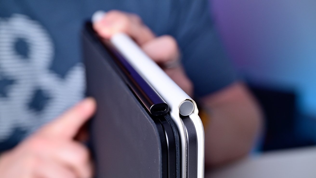
The old and new Magic Keyboard hinges
The old metal tube hinge has been replaced by a metal one that’s squashed into a thinner oval. It’s not much bigger than the built-in USB-C port.
Unlike the previous covered hinge, the new one is exposed. That means you’re going to have to be a lot more careful placing it down, or you may scratch something.
Magic Keyboard for iPad Pro comparison – Weight
While Apple did add more aluminum to the accessory, it also managed to lose some of the weight. Add in the iPad Pro’s weight loss, and it’s a lot easier to carry around.
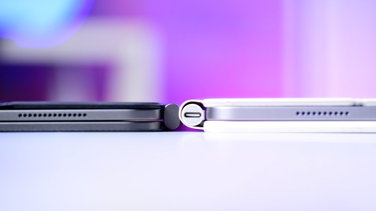
A Magic Keyboard size comparison
The old 12.9-inch Magic Keyboard for iPad Pro was 699 grams, while the new 13-inch version is 658 grams. As a package, the 12.9-inch keyboard and iPad Pro weighed 1,388 in total, but the new pairing is 1,239 grams.
The Magic Keyboard’s weight loss may be fairly minor, but it still helps overall.
Magic Keyboard for iPad Pro comparison – Trackpad
Another way Apple has improved the Magic Keyboard is by tweaking the trackpad. It’s now substantially larger compared to the first version.

The new Magic Keyboard has a much bigger trackpad
Apple accomplished this by moving the keyboard itself backward on the body. This made room for the new trackpad to take up space.
The larger surface makes it easier to perform multi-touch gestures on the iPad Pro without touching the display. It’s not quite as expansive as a MacBook Pro, but it’s a fair bit closer.
Magic Keyboard for iPad Pro comparison – Keyboard
The position of the keyboard isn’t just the only change. There’s an entire new row of keys to play with.
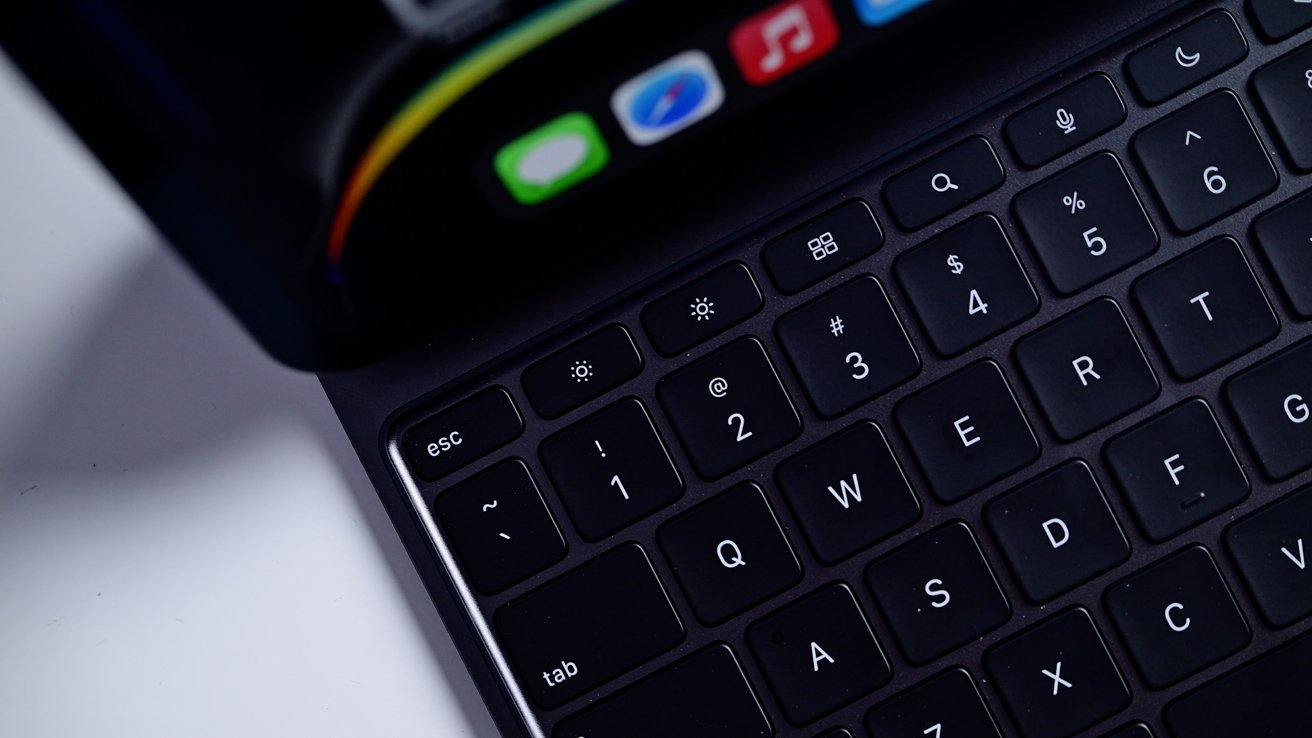
The new Magic Keyboard row of keys
While the old keyboard’s top row consisted of numbers and the delete key, the new version now has a function key row. This row is similar to a Mac keyboard, including a dedicated escape key, and buttons for brightness, volume, and media playback.
They’re still backlit and use a cantilever design, so that hasn’t changed either.
Magic Keyboard for iPad Pro comparison – Sturdiness
One thing that hasn’t improved is overall sturdiness. In fact, it is a little less sturdy to use.
Since the keyboard and iPad are lighter, there’s less holding it down on a surface when you tap the screen. The removal of the material on the hinge also makes an impact, as well as the iPad Pro sitting further back due to the keyboard movements.
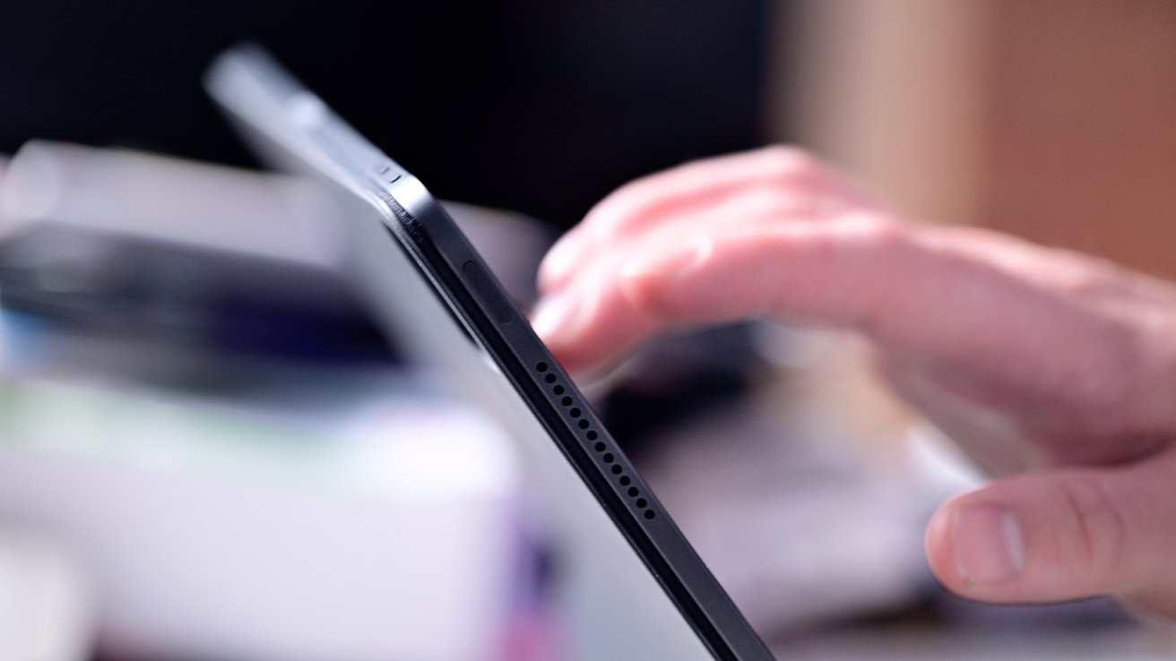
The new Magic Keyboard’s less sturdy to tap the iPad Pro on
This all results in the entire assembly being more wobbly and bouncing when you tap the iPad itself. Tap a bit too aggressively, and the front can lift up as it all rolls back.
Magic Keyboard for iPad Pro comparison – Change is (usually) good
Apple’s new Magic Keyboard results in a massively improved experience to users. The use of aluminum, the keyboard row, and the larger trackpad all make things a lot better when using it with the iPad Pro for long typing sessions.
The changes do make it a bit more flimsy to tap the iPad Pro itself, which you have to be more mindful of, though.
It even may allow some users to feel that they have the optimal mobile workstation. Something with looks approaching a mini MacBook Pro, but that can also offer stylus and touch features too.
Regardless of what you think about the changes, you don’t have much say in which version of the Magic Keyboard you can use with the new M4 iPad Pro. It works exclusively with the new 11-inch and 13-inch models.
The previous iteration is still available. It is only compatible with the iPad Air and older iPad Pro units, prior to the 2024 redesign.
Where to buy Apple’s Magic Keyboard for iPad Pro
Apple’s Magic Keyboard for the M4 iPad Pro is discounted now with promo code APINSIDER at Apple Authorized Reseller Adorama. Look for a link to reveal the coupon code field during Step 4 of checkout.


