Apple Photos is redesigned in iOS 18

Even before it gets Apple Intelligence, iOS 18 has made searching through Photos faster and easier, although it’s also buried a key feature for when you want to share several images.
Ultimately, Photos in iOS 18 is going to become much more of an image editor, with the ability to automatically remove unwanted elements from an image. That will require Apple Intelligence, which is not in the initial beta of iOS 18.
Nonetheless, the iOS 18 Photos app has had a major overhaul, with what Craig Federighi claimed was its “biggest redesign ever.” That redesign is immediately apparent on opening the app, where it feels as if your images are more prominent.
The new Photos redesign
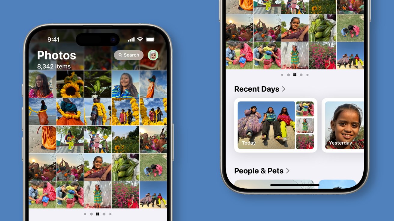
It’s arranged so that by default, roughly the top half is a grid showing the latest images, and beneath that is the start of a long list of options. Most of those are now much more visual, and it takes quite some scrolling to get to the old plain text list showing Hidden, Recently Deleted, and so on.
If you just concentrate on the top grid, you can pull it down to fill the entire screen. When you do that, the app surfaces a set of filters for Years, Months, or All.

Swipe from the top grid to see selected albums in a showcase view
There’s also a pair of significant changes when you’ve dragged the grid full screen. One is that you lose the ability to swipe from the right to get into the new series of Collections of images.
The other is that you actually regain a control that initially seemed to be a peculiar omission. It’s the Select button, by which you can then tap or drag over images to select them, ready to share the whole set at once.
It’s not clear why that button is no longer present in the default front screen. It does also reappear whenever you go into the various collections.
Collections are excellent
Getting out of these new sections is a little fiddly. Photos wants to show you images full-screen and when you have those, you can easily swipe to the next one, but tapping to get back the controls to exit the section doesn’t seem to always work.
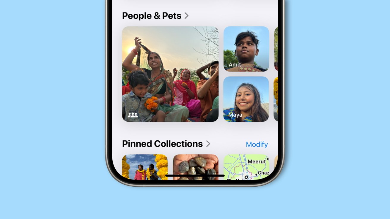
But the new sections, the Collections, are so nicely presented that somehow it feels as if the photographs are better. When you have the Photos grid at the top and you can swipe to the right to see your choice of main Collections, it is particularly absorbing and well done.
There’s also been an improvement to how Photos automatically categorizes images. Previously there were sections for things like Videos and Screen Recordings, but now there’s also Receipts.
In testing of a photo library that contained many badly-scanned pages of screenplays, several of those script shots were automatically filed into Receipts. Presumably it will be possible to correct that and re-categorize images, but seemingly not at present.
Searching is improved
We’re still not yet able to ask Siri to show us images of ourselves in New York — it does try, it will present you with photos of “Mia” in New York from the web — but searching by typing is improved. As well as auto-completing your search terms as you type, it keeps offering refinements after that.
So even after having found images from a search for “New York,” it then offered a pop-up that included options to narrow that search. For instance, it offered The High Line from the city, or the North Hudson.

Photos will categorize sections based on locations, people, pets, and other data
Photos also remembers those narrowing choices and offers them again the next time you tap into the Search box. It also suggests some searches that are presumably created by AI or Machine Learning, such as offering to search your specific location for images “in the Spring.”
What happens next
It’s searching where the addition of Apple Intelligence will probably most be felt. Although it could also change what images the app chooses to offer in, say, its Memories collection.
Even without the forthcoming AI features, the new redesign is deeply appealing. It does the job of managing impossibly large collections such that you can find what you want quickly.
Moreover, the way it displays images with its new grid and all of the Collections, make using Photos in iOS 18 more of a pleasure than it was.


