Article Hero Image 
Even if every part of the iMac has radically evolved, it’s still the only computer that debuted in 1998 that you can buy in 2022, because Apple got its core purpose right on this day, 26 years ago, when it went on sale
If there’s a single Mac that is the most beloved by its owners, then it could be the Macintosh SE/30, and it could be the “wicked fast” Macintosh IIfx, but it’s probably the 2006 Mac Pro. For being beloved by the sheer greatest number of users, though, it’s the iMac — the most successful series of desktop Macs that Apple ever made.
It’s not even close. That 2006 Mac Pro was not only a quite niche computer, but it was also the first of a series where every successive model has been late, and far less embraced by its market audience, including the latest Apple Silicon version.
Then for completeness, there were also other series of Macs after the original and before the iMac. But if anyone remembers the Centris or Quadra ranges, they don’t celebrate their anniversaries.
Whereas the iMac is now over quarter of a century old and there is a reason that the very first version of it is the machine that saved Apple. The iMac has never been cheap in any sense, but it’s always been remarkably good value with its all-in-one design.
The key is its design and how Apple — seemingly alone in the computer industry — saw that design is so much more than what something looks like. For instance, Bill Gates’s reaction to the colorful original iMac unknowingly defined his character as well as how most of the industry saw design.
“The one thing Apple’s providing now is leadership in colors,” he said. “It won’t take long for us to catch up with that, I don’t think.”
It was a shallow dismissal that displayed the computer industry’s then arrogant blindness to what people wanted. The iMac was a manifestation of the idea that Apple was building computers for people to actually use.
Building up to an all-in-one as we know it
Although Apple would make a big deal out of the iMac being an all-in-one computer, of course the original Mac was, too. And that tremendous SE/30, as well.
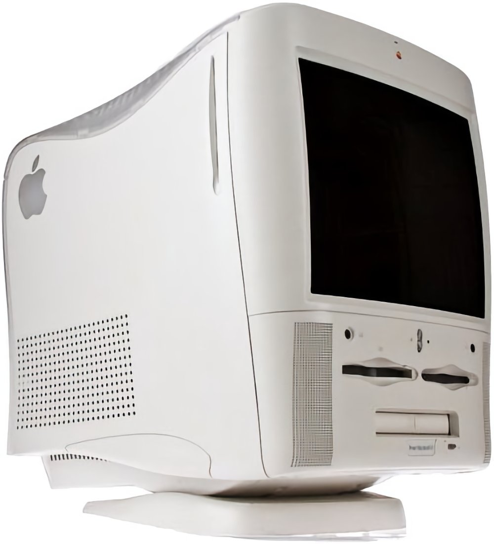
Both of those are classic designs that were well-received at the time. Yet the Power Macintosh G3 All in One computer, released not very long before that first iMac, was neither.

Immediately described as molar, for how it looked like a tooth that had been pulled out and polished, it was at least vaguely smooth. The Macintosh Performa 5200 from 1995, didn’t even have that.
It was as if Apple was hanging on to its aims with the original Mac, yet trying to also shoe-horn in extra features like TV sets and optical drives. If these mid-1990s machines were anything to go by, it was a combination that could never work.
Until it did, with the iMac.
Building up to a launch
Although it was August 15, 1998, when the iMac went on sale, we were first shown it much earlier on May 6 of that year.

Steve Jobs launching the very first iMac back in 1998
“Today, I’m incredibly pleased to introduce iMac, our consumer product,” said Steve Jobs at Macworld 1988. “iMac comes from the marriage of the excitement of the Internet with the simplicity of Macintosh.”
“Even though this is a full-blooded Macintosh,” he said, “we are targeting this for the #1 use consumers tell us they want a computer for, which is to get on the Internet, simply and fast.”
All in one means all in one
Apple only quite rarely shows competing products in its presentations, and then it is always to illustrate something, and frankly to mock it. In this case, Jobs talked about PCs and how they were slow, had no networking, and only came with “crummy displays.”
“And,” he added with an emphasis that rolled around his mouth, “these things are ug-ly.”
Apple obviously carefully picked its examples to make a point, but it picked them well. Comparing PCs and their nest of cables, Jobs said that with the iMac, “the back of this thing looks better than the front of the other guys’.”
Selling the iMac
You can have a great product, but it’s no use if no one gets to hear of it. Today, Apple can’t lift a finger without it becoming news, but back in the 1990s, few expected the company to even survive so nothing it did would get today’s automatic, instant attention.
Except that it did have Steve Jobs who, if nothing else, was very strong on presenting a case for why Apple was the best — or as he’d want you to think — the only option.
And for the well-designed iMac, Apple also made well-designed TV adverts. Jeff Goldblum presented these ads, each of which were the opposite of hyped up.
Instead, the ads were simple, straightforward, and funny. It’s very hard to do funny, and it’s even harder to do it when hawking a product — just ask Microsoft — but Apple did it.
The first iMac was priced at $1,299 ($2,500 in 2024 money). For that, you got a G3 233-MHz processor, a 15-inch display and it was all wrapped up in a very distinctive box. It was curvy, it was colorful, it was arguably a bit gaudy and bulbous, but it was like no other computer released up to then.
It was also the first major collaboration between Jobs and the then newly promoted senior vice president of industrial design, Jony Ive.
“This one is incredibly sweet,” said Jobs in a CNN interview. “This $1,299 product is faster than the fastest Pentium II you can buy. The market’s never had a consumer computer this powerful and cool-looking.”
“We have been working hard on fashion, which is very important in the consumer market,” added Jobs.
Interestingly, Jobs used that same CNN interview to reveal a much longer-term goal. “Apple will be working on strengthening its brand name,” he said, and specifically compared Apple to the likes of Nike, Disney, and Sony.
Never standing still
If you have a hit, you don’t do anything to damage it. Unless you’re Apple, in which case you famously take the approach that you need to destroy your products before your competition can.
At first, there was little sign of that with the iMac as the only significant change was in 1999 when the iMac was released in multiple colors.
But then in 2002, everything changed — except the bits that didn’t. The new 2002 iMac was still an all-in-one with an especially neat design, but otherwise it didn’t resemble the original iMac at all.
The colors were gone, it was solely offered in white, and the bulbous CRT casing vanished. In its place, Apple produced a half-dome-like structure, which housed all of the computer’s components.
On top of the dome was a strong silver bar that connected to a flat-screen display. You couldn’t see it without immediately wanting to adjust the screen, to touch and to move it.
In person it was larger than you’d expect from photographs, but it was an iMac with real personality — and then Apple killed that one off, too.
In 2004, we got what today seems like the very definition of an iMac. The whole computer is one single, slim display, with a distinctive chin at the bottom.
It was so slim that you really did believe that you were only looking at the display, that the computer had to be somewhere else.

Two decades later, we still have that same basic design. Although that single, slim display has no bulge on the back — and is now just incredibly slim, so slim that Apple had to fit a headphone jack into it sideways to get it in at all.
Plus these most recent designs have thinner and thinner bezels around the side of the display.
But otherwise, the iMac today is visibly the same beast as it was back in 2004. There is no mistaking that this is an iMac — from the outside.
Internally, invisibly, though, it has changed hugely. Components are smaller, the display is much better, but the real differences have been in the series of processor updates — and materials.
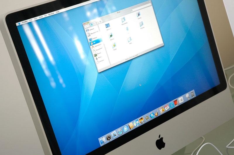
In 2006, there was the first Intel-based iMac. Then in 2007, we got the first iMacs that were made from aluminum.

If the 2004 chin design is clearly part of the iMac lineage, and then the aluminum version is even more familiar, it was 2012’s revision that made the modern iMac.
iMac Pro and the future
Apple stuck with that same chassis design for longer than any other iMac version. Seemingly now ignoring its aim of competing in fashion, Apple had a design that worked superbly, that few rivals were attempting to mimic, and it left it alone.
Aside from spec bumps and internal revisions, the iMac felt like it was done. Still brilliant value, still highly desirable, it seemed it wasn’t going to change, it seemed there wouldn’t be anything dramatic changing.
In 2017, Apple launched the 27-inch iMac Pro, vastly faster and hugely more attractive to power users — yet even now, it still it looked the same. Apple gave it a darker color and continued selling it alongside the regular iMac.
And at the time, buyers ran to embrace it. Especially disenchanted Mac Pro users who at the time were being told a new model of their favorite machine was coming in the next couple of years.
In retrospect, it now seems as if Apple made the iMac Pro as a stop-gap while it worked on the next Mac Pro. That seems especially likely since having made this amazingly powerful machine, it then stopped making it.
Apple didn’t significantly update the iMac Pro between 2017 and 2021, when it then discontinued the model.
At the same time, Apple wasn’t exactly doing a lot for the regular iMac updates.
Apple Silicon arrives in the iMac
Perhaps because Apple was concentrating on the massive internal changes, it didn’t make any alternation to the exterior of any of those first M1 machines. It’s possible, too, that Apple wanted to stress how these were still Macs, despite the radical change under the hood.
Whatever the reason, that retention of the old design stopped with the 2021 release of the 24-inch iMac with Apple Silicon.
If you just glanced at the new M1 version, you’d still recognize immediately that it was an iMac. Apart from new pastel colors, and the curious omission of the Apple logo from the front chin of the machine, these new iMacs are unquestionably part of the lineage.
Yet they also have a cleaner, neater, design, where the screen gets thinner bezels.
Except, it was a 24-inch iMac when previously Apple also produced a 27-inch one — and that 27-inch model was arguably the sweet spot in the whole Mac range.
Since then, a 27-inch model has been continually rumored, but it keeps not coming. So far the iMac has stayed in this 24-inch format, although it has seen processor upgrades.
Perhaps oddly, there was never an M2 iMac. The range went straight from M1 to M3.
Form follows function
“Form follows function” is an architecture and engineering phrase that means you design something to work first, and whatever it looks like is whatever it looks like.
Apple does this too, most especially with the iMac, but the company has a different idea of what the function of the computer is. Where every competitor looks to faster components and higher specifications, Apple does that too but knows the function is to be usable.
As it was right back at the start of the iMac, the design is really about making a computer for people to use. Whatever it’s being used for, it feels as if there is just the user and the screen, there is nothing else getting in the way.
That’s perhaps the same ethos that led to the original Mac in 1984. But it’s certainly the one that has kept the iMac a hit for over a quarter of a century.


