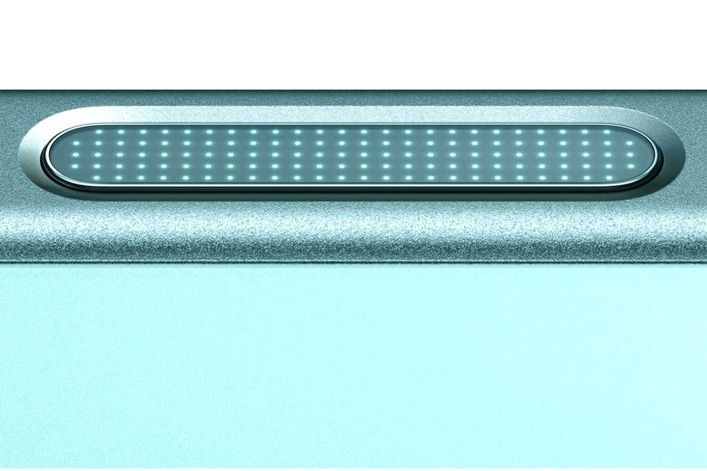
For the second year in a row, Apple has added a button to the iPhone. New iPhone buyers will have two different hardware buttons to get familiar with, both the Action Button (introduced on the iPhone 15 Pro, and now on all iPhone 16 models) and the all-new Camera Control button.
For those of us who remember the era when Apple attempted to strip buttons and ports off of all its products–reaching a low point with the completely buttonless iPod shuffle–it’s a remarkable turnaround. I got to spend some time trying out Camera Control this week, and while it’s not guaranteed that everyone will love it, I think it’s got a lot of advantages that will make the iPhone a better camera.
Let’s start with the most important thing about Camera Control: It’s hardware. It is a physical button you push down, and things happen on your iPhone. This might seem obvious, but the iPhone came to exist because of the philosophy that the more that could be done on a touchscreen, the better. That’s why we all use touchscreens now, and the Blackberry has been banished to the land of wind and ghosts.
But as much as a good call as the original iPhone design was, there’s something about physical controls. You can find them by feel, which you simply can’t do with a touchscreen. They can move and provide tactile feedback. Wrap it all together and you end up with an interface that works with our brains’ innate desire to store physical actions as muscle memory.
There’s something about physical controls. You can find them by feel, which you simply can’t do with a touchscreen. They can move and provide tactile feedback. Camera Control button is a winner when it comes to being tactile.
The Camera Control button is a winner when it comes to being tactile. When you press it down all the way to launch the Camera app or to take a photo, there’s a satisfying popping feeling on your finger, courtesy of a little extra haptics. Taking a picture is as simple as pulling your phone out of your pocket and feeling for the Camera Control button. This was the solution for physical cameras for years, and now it’s on the iPhone. Apple has even aped the old-school camera interface where you press halfway to focus and then all the way to take a picture.
The iPhone’s touchscreen interface is amazing because it can be literally anything you want it to be. But I can’t tell you how many people I see struggling with the Camera app, swiping and tapping and trying to get the right mode so that they can take a picture–or hand the phone to someone like me to take a picture for them. In those moments (when you’re out in bright sunlight that just makes it harder to see) and just want to capture a moment before it’s gone, the last thing you want to do is fight with a software interface. The platonic ideal of camera interfaces is “point and shoot” for a reason. Point and swipe or tap? Not as good.
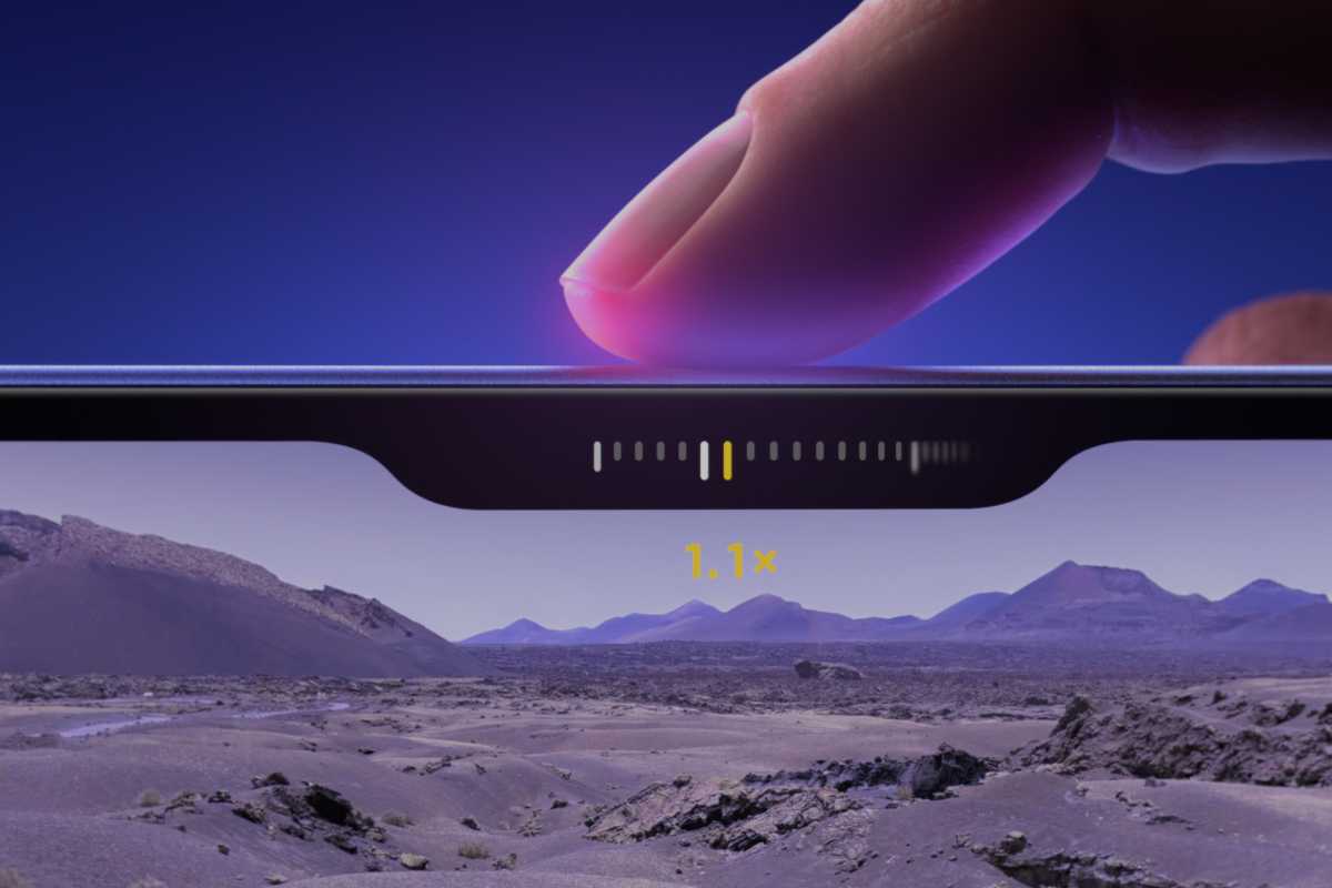 YOu can swipe on the Control Control button to adjust settings.
  YOu can swipe on the Control Control button to adjust settings.
Apple
 YOu can swipe on the Control Control button to adjust settings.
Apple
Apple
And, yes, I know that you’ve been able to use a volume button to take pictures for ages and that you can get to the Camera app by swiping on the lock screen or tapping and holding on the Camera icon. All true! And yet… people don’t. This is Apple realizing that people don’t, and won’t, and trying to give them a safe, dedicated place for all their photography.
Camera Control is as complicated as you want to make it. At its core, it really is point-and-shoot. When you press the button all the way, you take a picture. (If your camera app isn’t open, it’ll open it first–and yes, third-party camera apps can replace Apple’s Camera app if you wish.)
When you press halfway down, things change a little. Most of the Camera app’s chrome falls away, giving you a simpler preview of your shot. You’ll also see a small horizontal interface pop out of the screen right below the Camera Control button. This is a set of controls you can adjust by swiping your finger left or right, just like you might if you used a digital camera that had a control dial in addition to the shutter button. This control might let you dial in a zoom level, for example.
And if you want even more control, you can add another layer of complexity. Press halfway down twice, in the style of a double-tap (but without lifting your finger!) and the interface goes up one level, to a collection of different controls that you can use when you slide your finger. I don’t imagine people will be toggling back and forth between different controls often, but it does allow you to pick the set of controls that are the most important to you and make those the ones that appear when you use the camera. For example, maybe you want to switch between different Photographic Style options rather than zoom levels. Here’s a list of everything you can do with Camera Control.
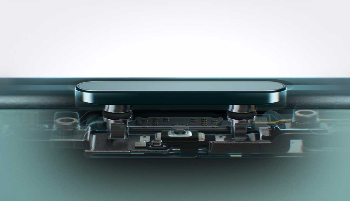
Camera Control has a tactic engine built in to give just the right feedback.

Camera Control has a tactic engine built in to give just the right feedback.
IDG

Camera Control has a tactic engine built in to give just the right feedback.
IDG
IDG
Look, I’m a power user. I love optional complexity. But it’s got to be optional. The base functionality needs to be simple enough for regular users–and I think the Camera Control button will probably fulfill their needs. There’s added complexity if you want to learn how to access it, but the bottom line is that it’s a button you press to take a picture, and that’s what it should be.
When Apple introduced the Action button last year, it suggested it could be used as a camera shutter button, and a lot of people probably used it as such. But the Camera Control is entirely about taking pictures and it’s on all four new iPhone 16 models, which I think gives it a better chance to succeed. The Action button can be repurposed for pretty much anything you want it to do, but Camera Control should remain focused on camera stuff. Apple needs to stay committed to it, continue to improve and refine the software attached to it, and avoid attempts to overcomplicate things. It will only succeed if it’s as easy to use as the shutter button on a traditional camera.
Learn more about the new phones with Macworld’s iPhone 16 superguide.

