Apple’s latest update to iOS 18 brings more customization and iMessage features to the iPhone. However, it lacks the heavily publicized and all-important Apple Intelligence.
It’s the fall, and that means Apple has released a new operating system for the iPhone. For 2024, the new device range is the iPhone 16 family, while iOS 18 is the software running on it.
However, following the last few years of updates, we’re now at a point where most of Apple’s changes could be considered quality-of-life improvements. You wouldn’t expect it to be groundbreaking, but there’s usually something interesting for users to enjoy.
It’s safe to describe a lot of the changes in iOS 18 in this way, except for one very important and absent collection.
iOS 18 review: No Apple Intelligence
The iOS 18 section that Apple is certainly leaning on as the big feature to watch out for is Apple Intelligence. It’s Apple’s attempt to catch up on a tech sector infatuated with artificial intelligence and generative AI.
However, the big problem is that no one will actually be able to enjoy it at the initial release.
The features are not being made available as part of iOS 18 itself. Instead, users will have to wait until iOS 18.1 before seeing some of the initial elements roll out.
The first wave, at least according to the beta testing of iOS 18.1, includes a collection of writing tools that will handle things like proofreading and rewriting your text. It’s like a built-in version of Grammarly, without the subscription.
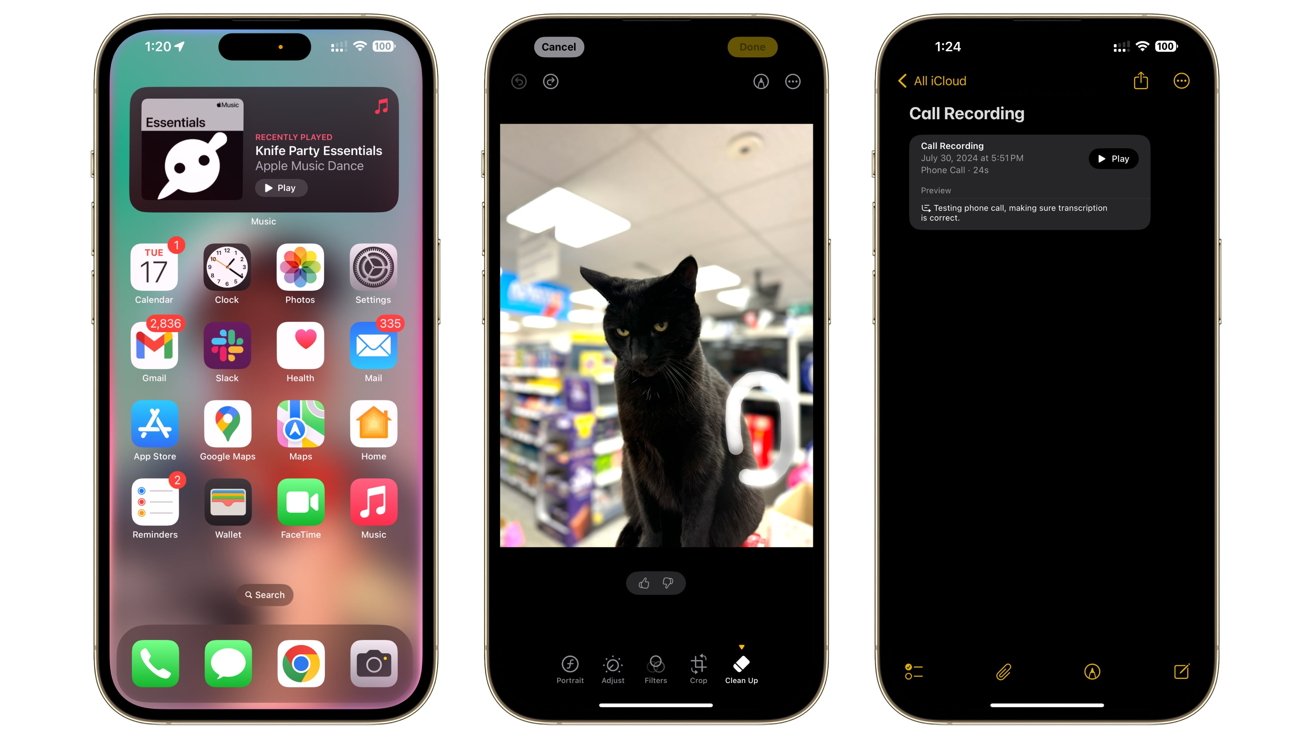
iOS 18 review: Apple Intelligence brings new features, but not in iOS 18.
Then there are things like the imaging capabilities, such as Clean Up for Photos. It can remove unwanted bits from your photographs with relative ease, using generative AI to fill in the gaps.
Image Playground will also be very useful, with images generated from prompts and insertable into various iOS apps. Genmoji will work in the same way, giving even more flexibility to how users graphically communicate in iMessage conversations.
These and a lot more features are on the way with Apple Intelligence. The problem is that it’s not part of the main iOS 18 release, despite arguably being the biggest and most important part.
It’s not going to be complete when it does arrive, if betas are to be believed. The betas had the text editing features at first before Clean Up for Photos, but at the time of publication, Image Playground and Genmoji hadn’t appeared.
And we haven’t even discussed Siri yet. Aside from a new multi-colored and glowing interface, Siri is supposed to be smarter than ever before.
In part, it will be because it will understand personal contexts, namely the relation of you and others in messages, emails, photos, calendar events, files, and more. This analysis should allow it to understand complex queries such as “When will Mom’s flight land” using elements of prior communication with her.
Siri will also be able to perform actions in first and third-party apps, such as basic photo edits. It will be able to understand what’s onscreen and answer some queries based on that.
Along with more resilient query handling, Siri should also provide additional benefits with an integration with ChatGPT.
It’s probable that when Apple does release it, it won’t come all at once.
This isn’t entirely new for Apple software releases, as it has frequently shipped iOS features long after the milestone release. For smaller features, this has been acceptable to users for a long time.
However, the problem here is that Apple is putting its marketing might behind Apple Intelligence. The fact that Apple’s making a big song and dance about it so long before iPhone users can actually use it all may be infuriating to some.
When people are marketed major software features alongside a new device launch, such as the iPhone 16, they expect it to be out alongside it.
Then there’s the fact that it’s not going to be available to everyone when it actually arrives either. Owners of the iPhone 16 will be fine as their devices will support it. So will iPhone 15 Pro owners, since their hardware was able to try it out in beta.
There’s also the problem that anyone with an iPhone that’s older than those models will not be able to benefit from Apple Intelligence. They could still install iOS 18, but those features will simply not exist, unless they upgrade.
When Apple Intelligence eventually arrives, it will help users feel as if iOS 18 has actually moved forward a considerable amount as an update. The issue is being teased about it, and still having to wait.
iOS 18 review: Lock Screen and Home Screen
What does arrive with iOS 18 is an increase in the amount of customization options that are available. This has been a pattern for the last few generations, but iOS 18 brings it to a more granular level than ever before.
This starts with the Lock Screen, the first thing you see when you unlock your iPhone. Before, you were stuck with the flashlight and the camera icons, so you could quickly load each of them up without fully unlocking the iPhone.
Now, as part of the usual customization options for the Lock Screen, you can change those buttons for something else. Apple includes quite a few different options by default, so you could instead get quick access to the Apple TV remote or the Translate app, for example.
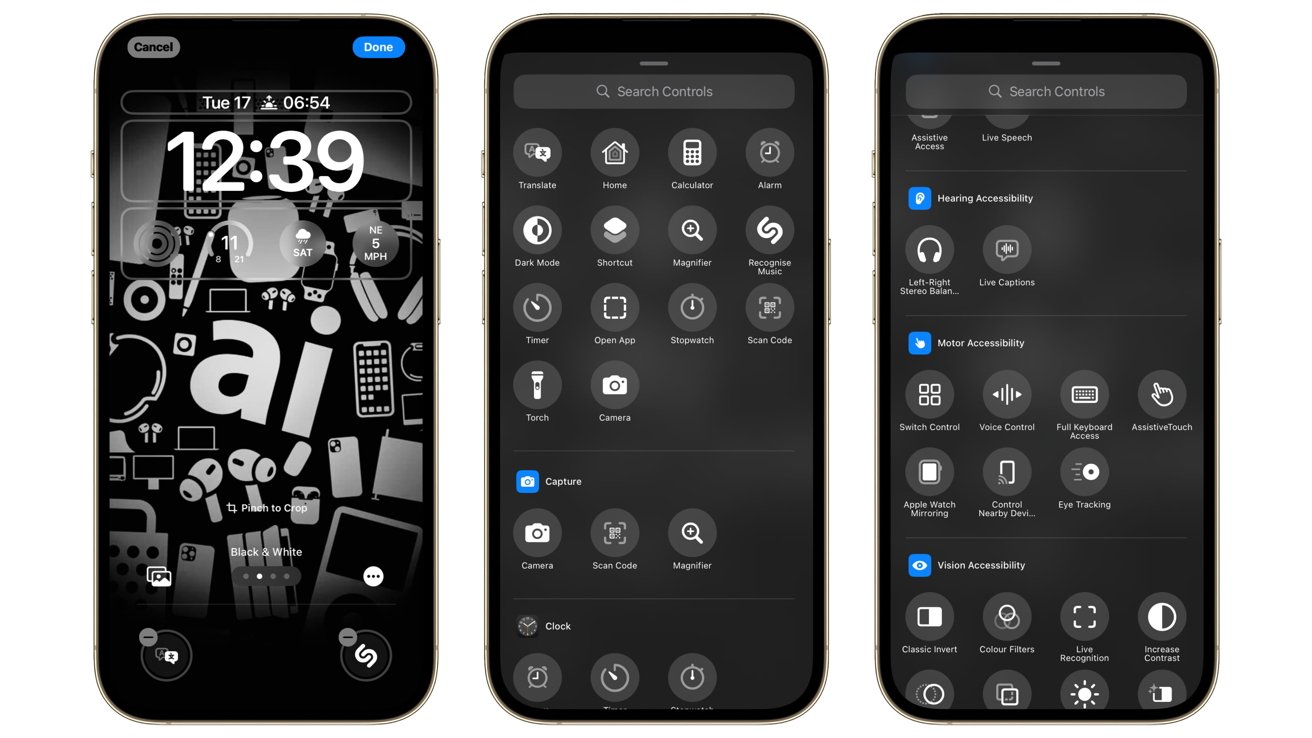
iOS 18 review: You can now change the Lock Screen’s Haptic Touch buttons
Having instant access to the flashlight has been extremely useful in the past. But being able to change it for something else entirely is a much better result.
The customizations continue to the Home Screen itself, specifically where you can place icons on the screen. There’s still a grid that everything aligns to, but now you can be more exacting with your positioning.
Sure, there’s still the icon shuffle when you move your selected app into a group of others, but placement now takes into account spacing. You can leave gaps in the grid where an icon would usually shift up and to the left to fill automatically.
The grid still shuffles if you pull out an icon from the group, so you can’t just make a gap in a nearly full grid. But, you can pull icons away and segment them from the group, creating a gap in the process.
This gives users the ability to place icons practically where they want them to be, with a little work. If you have a background featuring an element you want to see and not be blocked by icons, you can certainly create enough space to keep it visible.
Family or pet photos as backgrounds will no longer be littered with icons and widgets covering faces, unless you let them.
If you don’t want to have labels on your apps, you could do away with those too. A new large mode increases the icon square while simultaneously hiding the associated name.
It’s an aesthetic choice, but one that could be beneficial if you primarily look for apps by the icon rather than the name. This could be an issue if you have similar-looking apps, but in most cases, it’s fine.
Continuing the app customization, the Dark Mode option of iOS is now improved with extra icon options that change how they appear. Light and dark versions of icons are now available.
![]()
iOS 18 review: Dark mode icons and gradients
For many of Apple’s apps, they change to a much darker layout with colored highlights of the elements that make up app logos. This also applies to third-party apps too, such as a predominantly white icon having the background changed to black.
In some cases, the colors also invert, such as a white logo on a bright orange background changing to a black background and an orange logo.
For those who want a more unified color scheme, there’s the option for tinted icons. These take the form of being similar to the dark variants, except that the other colors of the app icon can be changed to a specific color.
For multi-colored icons, this highlighted color is still used, but with different shades, so that the icon is still recognizable. It even affects widgets, so they all match up to your selected color scheme.
This feature is certainly one that will appease people who want a clean aesthetic for their smartphone screen. However, you do lose the ability to recognize an app by color, which could be a problem for some users.
iOS 18 review: Control Center
Control Center, the section that brings up a list of essential controls for your iPhone, has been overhauled in iOS 18. Sure, you could customize your controls a bit in iOS 17, but this time you have way more ways to change how everything appears than ever before.
For a start, it’s been turned into a multi-page feature. You can create multiple pages that you can swipe up and down through, so you can better organize all of the elements.
For example, you could have the top-most page consist of your essential controls, followed by a second containing your Apple Music controls. A third could contain widgets for a HomeKit installation, while a fourth could be all of your connectivity settings, such as for Bluetooth and Wi-Fi.
You can set Control Center with up to ten pages, which would be overkill for most iPhone users. Even so, the option to do so is a great addition, especially from an organizational standpoint.
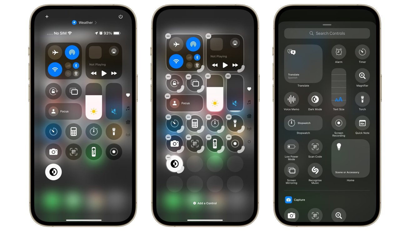
iOS 18 review: Control Center is a lot more customizable
As for the elements you can place into the pages, Apple also makes that a lot easier than before. Now, users need only to hold a finger down to enter a layout editing mode, just like the home screen.
This time, the icons for the Control Center elements do have a minus symbol in the top-left corner if you want to remove them. In the bottom right is a curved element, so you can turn icons into larger widget-style versions.
You can also re-order the page like Home Screen apps, with a press and drag moving them from one place to another. Again, you can create gaps in the layout if you want.
Adding options to Control Center is just as easy, as there’s an “Add a Control” option at the base of the editing screen.
This brings up a list of controls and widget-style collections that you can add to the Control Center, covering a very large number of functions. This is divided down to type, such as Clock functions, Display & Brightness, and Wallet.
This section also includes quite a lot of Accessibility functions, including sections for hearing, motor, and vision accessibility functions. While the accessibility functions are still managed within the Settings app, the option of accessing them quickly within Control Center is a fantastic move for those who need it.
That list isn’t just going to be for Apple’s selection of apps and iPhone functions. Third-party controls are also supported, so developers can further extend the utility of their apps using Control Center.
This could well become an interesting element in the future as more embrace the opportunity. Since many Control Center controls can also be accessible from the Lock Screen thanks to other personalization changes, this could be an even more useful feature change in the future.
iOS 18 review: Photos
One of the biggest divisive points of the iOS 18 update is probably the Photos app. The iOS 17 iteration was easy to navigate, with a base navigational tab system that made it simple to get to the right section for what you wanted to do.
That’s gone now, obliterated by the new app that opts for a unified interface. Yes, you’re greeted by a neat grid of your photographic history, but after that, expect a lot of scrolling.
Swiping down brings the full grid into view, with search at the top and filtering and reordering options at the bottom. Select Months or Years and to discover your media grouped up by date, with a tap of a year bringing you to the Months view for that period.
If you want anything else other than immediate access or time-based division of your image archives, you’re going to be swiping up. Instead of having an easily accessible menu, Apple put all of the elements below the grid.
When you first access it, you’re gonna see collections like Recent Days, People & Pets, and a selection of pinned collections, for example. After scrolling past memories and featured photos, you eventually stumble upon the Media Types options, Utilities, and Albums.
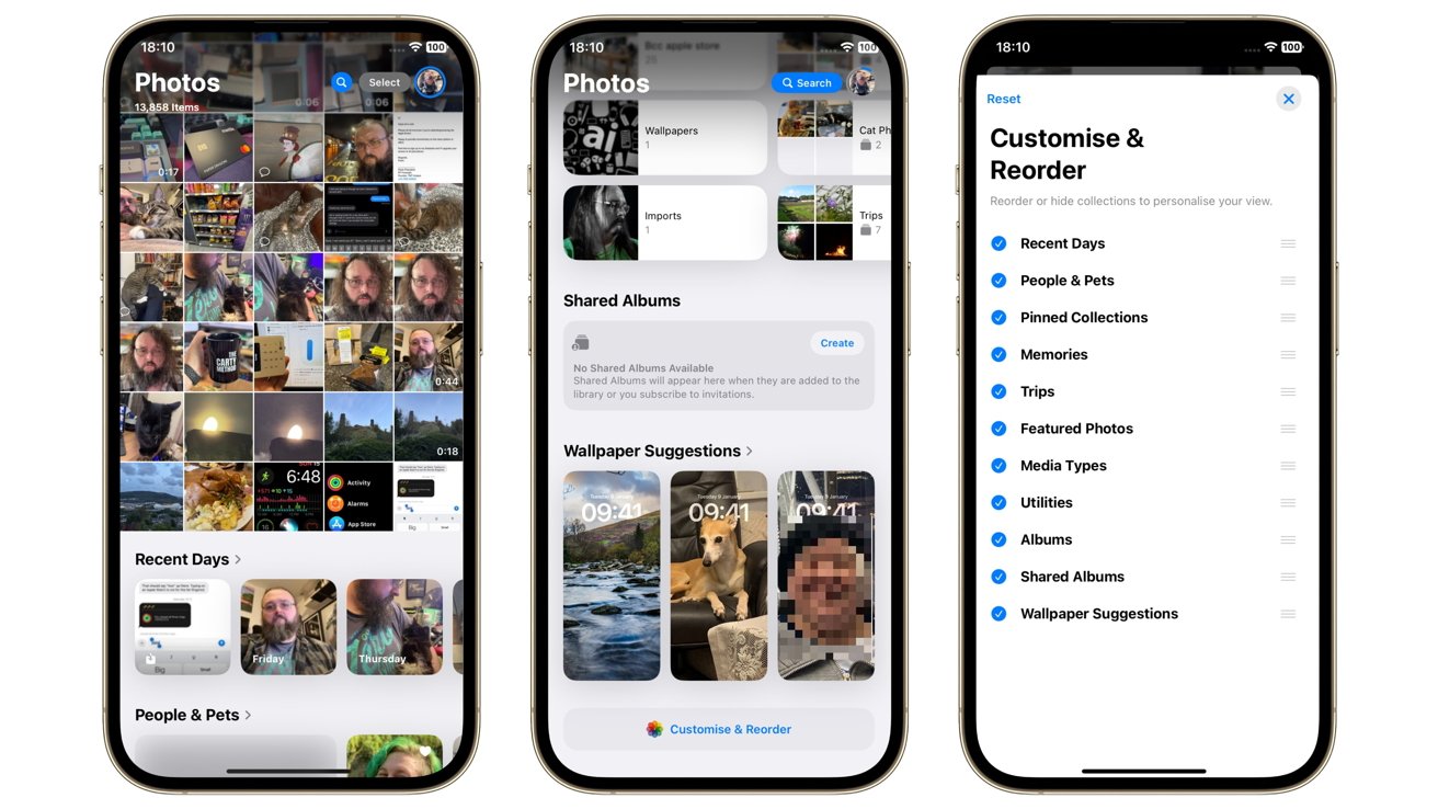
iOS 18 review: Photos in iOS 18 entails a lot more scrolling
You can fix this by scrolling right to the bottom, where there’s an option to customize and reorder the Photos app elements that exist below the grid. You may want to move Media Types up higher, or things like Recent Days and People & Pets lower in the list, depending on how you value Apple’s suggestions.
You can also disable some elements from appearing full stop. If you’re not one to go visit other countries, then you may not want to see Trips on the list at all.
Reorganizing the list does help, but it doesn’t take away the need to scroll through the app to what you want. It only shortens how much scrolling you need to do.
Users of iPadOS 18 will, mercifully, still be able to use a sidebar to access their pinned collections and essential options. It’s a shame that there’s no similar swipe-in sidebar to do the same for iOS 18’s version.
What has definitely improved is how Photos can automatically group collections of images for easier sharing. It will generate collections based on your trips, your recent days of photography, and groups under the People & Pets category, for example.
Its ability to create a montage of events as Memories is also useful, with the automation now matching a story arc instead of sticking to chronological order. It’s also pretty good at titling and adding music to the pieces.
The app is also capable of giving you more options to personalize your iPhone Home Screen. It will make wallpaper suggestions, with a quick tap taking you to the Lock Screen edit dialog to make it a reality.
Apple does include a lot of smart elements in Photos, but there are some elements still left on the table. With the release of Apple Intelligence, it will include a natural language photo and video search, so you can look up images of a “white cat on a chair” if you want.
The Clean Up tool will also eventually arrive to eradicate photobombers and unwanted other elements from images. Memories will also be boosted by Apple Intelligence, creating a memory based on a description.
Alas, these aren’t coming for a while.
iOS 18 review: Messages
The ever-reliable Messages hasn’t changed much over the years. After seeing the overhaul of Photos, texters are probably breathing a sigh of relief since the changes are much smaller this year.
The most obvious and probably most used will be text effects, which provide formatting options for your messages. You have your usual collection of bold, italics, underline, and strike-through text, as well as some animated versions.
Making the text bigger or smaller, exploding letters, or making them jitter can certainly make the conversation more interesting. At least from a text standpoint.
Tapbacks gain the ability to use any emoji or sticker, adding even more ways to respond to a message, other than using text. This is quite handy, as Apple’s previous tapback options were quite basic, and this can at least allow for memes to become responses.
A less sexy but essential change is the introduction of Rich Communication Services or RCS. This will make it so you can send more iMessage-style messages to other people who don’t use Apple products, but it won’t solve the Blue-Green Bubble war.
Following Apple’s previous success with satellite-based emergency features, it also brought in some more normal Messages functions.
Messages via Satellite enables you to get messages out to others, without necessarily needing a phone signal or Internet access. Off-grid users can also use SMS over Satellite, or even iMessage over Satellite with end-to-end encryption, emoji, Tapbacks, and replies.
This is certainly a great addition to the previous emergency-focused satellite-based features. Though more for the ability to ping family that you’re OK while camping, less for the emoji usage.
For iPhones with a Dynamic Island, there’s now a Live Activity for iMessage over Satellite that tells you if you’re connected via the space-based system or not. Again, this is very handy for an at-a-glance notice, as you can sometimes get spotty satellite access depending on where you are in the world.
Probably the best feature but likely to be under the radar for most users will be Send Later, which will let users choose a time for their message to go out. There are the obvious message types this could cover, but you could easily imagine this being handy from a care perspective.
Sending a message to a loved one to take their tablets on time could be a great option if you’re not there to help them remember.
iOS 18 review: Passwords and Privacy
The release also incorporates another big initiative that changes a fundamental bit of Apple’s ecosystem: Passwords.
The keychain was known as the main storage place for credentials, and one that worked across the Apple ecosystem if you had it set up right. The problem was that it was not obvious for typical users to actually manage for themselves, short of appropriate prompting by the operating system.
With the Password app, it gives users an easier way to access their account passwords, including Wi-Fi passwords, all in one place. It’s also one that automatically works across multiple devices, and even on non-Apple products thanks to accessibility under Windows.
There are even options to share passwords and passkeys with members of a user’s Family group, if required.
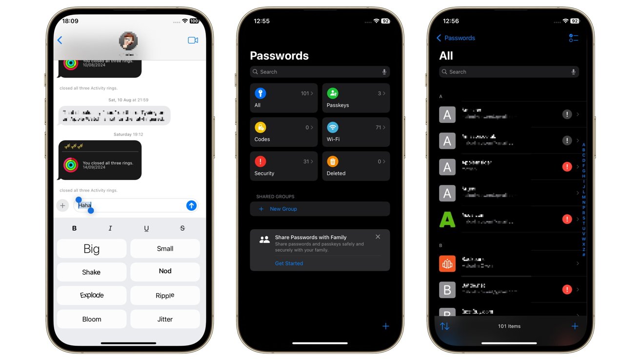
iOS 18 review: iMessage gains new text effects [left] and Apple’s Passwords app.
The shift to Passwords as an app may help convince some users not to take up the services of third-party password apps. It may be a redressing of what Apple already offered to users, but it does so in a more user-forward and understandable way.
While Passwords as an app is a great move forward for user privacy, Apple also offers a few other security and privacy improvements, including app-specific changes.
You can add locks to apps, making them inaccessible unless you unlock them first with Face ID. This seems counterintuitive since you have to unlock the iPhone in the first place, but it makes sense if someone access your iPhone after you unlocked it.
If you’re the kind of person who hands your iPhone off to a child to entertain them with YouTube or games, the last thing you want is for them to sign into your work email. Likewise, it could help to prevent a nosy colleague from trying to check out your most recent photographs.
You can go one step further and fully hide apps from view. Not only are they locked off from access by others, but they’re completely hidden, even without any visible notifications.
The apps are accessible within a hidden apps folder, which itself is locked up.
While this can be handy to fend off snooping friends, it also offers a more serious protective measure. In cases such as abusive relationships or when specific apps may be considered an issue in some cultures or regimes, it does give another line of defense.
It seems like a trivial thing to add, but it is a big thing for those who need it.
As usual, Apple did introduce more security features, such as Communication Safety’s blocking of sensitive content from children’s eyes unless the Screen Time password is entered.
Since apps can easily take advantage of your contact lists, such as by passing the details off to marketing data collectors, Apple has also helped to minimize that sort of collection. Rather than sharing the entire contact list with an app, you can elect to only hand over specific needed contacts.
This data limitation also extends to Bluetooth, with a new accessory setup process that allows for device pairing. One that also limits the data being passed on to leave out other nearby Bluetooth devices.
To cap it all off, Apple’s made it a lot easier to manage the privacy settings on a per-app basis. Inside the new Settings app, which itself has been refreshed in appearance and shifted the lengthy apps list to its own page, the Privacy & Security settings has been given a big update.
Now it’s much easier to see the types of data being shared with apps. It’s also easier to disable specific types of data access for individual apps, such as disabling access to the camera or HomeKit.
Apple did pride itself on privacy and security before, as it’s spent years campaigning to maintain it as much as possible. It’s just a lot easier for users to manage now.
iOS 18 review: Notes, Math Notes, and Calculators
There are quite a few edits made to Notes that make it more usable for off-the-cuff digital scribbles. For a start, there’s a lot going on with audio recordings.
You can record audio and store them alongside your written and drawn notes. This can certainly help your later re-reading and re-hearing of what you said, especially since it’s so much easier to listen to some information but to see other types.
The audio recording isn’t just limited to your own notes, as you can also record phone calls. Recording for your own purposes is great when it’s to someone where words count, like a lawyer, and it even handles the legalities of telling all parties that the call is being recorded.
Even better, both audio recordings and phone calls can be live transcribed, giving you a text that is in sync with the audio itself. This is useful for quickly scanning an audio recording for a soundbite, since you can follow along with the text.
For college students, it’s easy to imagine that this will make lecture recording and note-taking much easier.
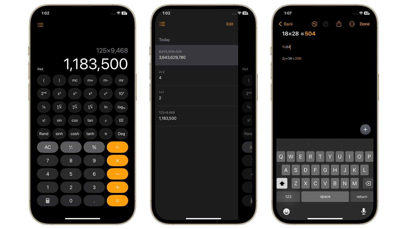
iOS 18 review: The Calculator with Math Notes
To further enhance long stretches of text, highlighting now offers five colors to choose from. It sounds excessive, but color-coding text is a great way to study.
Connected to this is the ability to collapse down sections of text in an extremely long passage.
One element of Notes that is an interesting one for homework purposes is Math Notes. Accessible within Notes and via the Calculator, it’s possible to write expressions and equations and to see results offered straight away, even graphs.
This Math Notes functionality even extends to assigning and understanding variables in equations.
On the Calculator, aside from note-taking entries, you also gain histories, unit conversions, and editable expressions. You can even use a scientific calculator in a portrait orientation, without needing to go into landscape for it.
Some of these pretty useful mathematics elements can also be accessed elsewhere. If you’re in Messages or Mail, you may see suggestions from Math Results you had previously worked on that you can insert into a conversation.
Increased mathematical functions may seem like an odd thing to enthuse about, but everyone can do with immediate access to math in their lives.
iOS 18 review: A better Safari
Apple did make browsing a bit more smoother, especially for a cramped screen used to browse mobile websites.
For a start, Highlights can seek out and detect the most useful details on a page for you, such as how to get to a location or contact details. With the ornately designed modern websites that exist today, sometimes users really do need help finding that bit of info on the page.
Speaking of design, Apple also includes a feature called Hide Distracting Items. As the name suggests, you select the tool in Safari, then tap on the bit of the website you’re viewing that you don’t want to see anymore, and it’s removed from view.
This is a thing that could worry advertisers, but Apple has previously said it won’t work that way as it resets when the code changes. It is more useful if you’re on a website with a banner or a UI element covering the bit of the page you’re trying to look at.
Reader View will also offer you a table of contents and, when Apple Intelligence eventually rolls out, a summary of the articles.
iOS 18 review: Walk and Play
Maps didn’t get a massive update this time around unless you’re really into hiking. The 2024 release includes new topographic maps, which tell hikers what hills are on their potential march through the wilderness.
The hiking kick also includes creating and saving walks and hikes for later, complete with custom routes that are accessible offline. If you’re in a U.S. national park, you also have thousands of premade hikes at your disposal.
All of said trails have turn-by-turn navigation, which is very handy when you may be far off the beaten track.
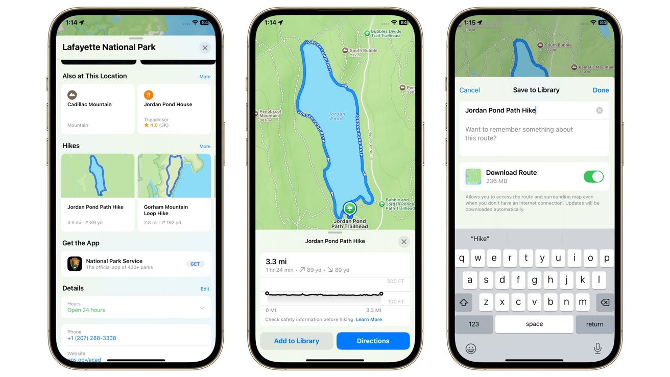
iOS 18 review: Hiking is a big feature in Maps now
If you’re more of a homebody and prefer to game on the iPhone, then Game Mode will be very useful. Automatically kicking in when you launch a game, it performs multiple tasks to improve your gaming experience.
For a start, it reduces the amount of background activity, so more resources are made available to render and play the game in the first place. With more AAA titles gradually making it onto the iPhone, every resource available will be needed for optimal gaming.
At the same time, it also makes wireless accessories more responsive, including game controllers and AirPods, which also gain Personalized Spatial Audio for gaming. While these are changes that will certainly be more useful for competitive gamers, they’ll also be welcomed by those with more casual pursuits.
iOS 18 review: HomeKit and CarPlay
HomeKit received quite a few new additions for iOS 18, with a lot of them being a big step closer to a fully automated future home.
For a start, the hands-free unlock with Home Keys is a great idea. It’s surprising that it’s not been a thing that Apple has considered before for use with smart locks.
Connected to that, providing guest access to HomeKit-enabled devices like locks, garage doors, and alarm systems is also another logical leap that should’ve already existed. The addition of logging 30 days of guest activity at least alleviates any worries about providing said access to sensitive security elements of your home.
Matter pairing for devices without a hub is also a big deal. With Matter and Thread supposed to be used in more smart home devices in the future, it makes sense for Apple to prepare for that eventuality.
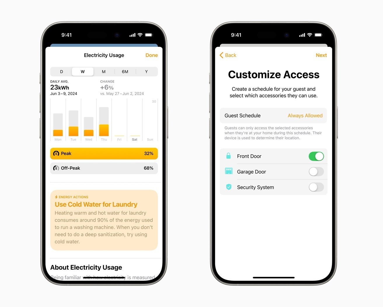
iOS 18 review: HomeKit can include energy company data and lets you offer guest access.
Another obvious and previously missed opportunity is robot vacuum support in the Home app. It now means your Roomba can be part of an entire scene called “Urgent cleaning session,” or at least you can now yell at Siri to clean your spillages.
The slightly oddball addition to HomeKit this time is the ability to see the electricity usage and rates for your home. It does become more logical as you think about it, since knowing your usage and therefore costs allows you to tweak how your home operates to be more efficient.
Alas, this is only really available to customers of the Pacific Gas and Electric Company at the moment. It’s a handy feature, but it remains to be seen how useful it could truly become.
Outside of the house and in the domain of CarPlay, the expansion of Spatial Audio into an infotainment system is certainly something that makes sense. If you have spent good money on a multichannel audio setup for use while on the move, Spatial Audio should help give you some mileage from that investment.
iOS 18 review: Tons of changes, but missing the important bits
As usual, there are way more features added to iOS 18 than can be covered in a single review, but the changes do touch practically every part of the Apple ecosystem. Everything from a redesign of iCloud settings to navigational improvements in Freeform, to even Apple’s extensive rebranding of Apple ID to Apple Account.
There’s, as always, a lot to explore and to take into account with the latest release of an Apple operating system. And for the majority of it, we can say it’s either very useful additions or a thing that can help users personalize their experience even more.
However, there’s always that main feature update that gets everyone excited. The main reason most users cannot wait to try out the latest release as soon as possible.
That thing for 2024 was supposed to be Apple Intelligence. Apple’s certainly marketing it in that way, as it could be a big transformative moment for Apple’s hardware sales.
The marketing effort is certainly mobilized, but well ahead of when anyone will reasonably be using it. It won’t be an Apple Intelligence party until OS 18.1 arrives, and even then it’ll be a muted presence.
Let us be clear. The release of iOS 18 is Apple’s best operating system for the iPhone ever. There’s no doubt about that.
It’s just that the celebration is well in advance of Apple Intelligence’s proper public introduction.
No one likes arriving at a party early.
iOS 18 Pros
- More customization options
- A highly adjustable Control Center
- HomeKit’s hands-free door unlocking
- Math Notes
iOS 18 Cons
- No Apple Intelligence until iOS 18.1
- Photos revamp needs some tweaks
Rating: 3 out of 5
This rating is based on iOS 18’s content, not what is available in iOS 18.1. Had the Apple Intelligence features been included, that rating would be a lot higher.

