Every September, Tim Cook confidently announces Apple’s greatest iPhone yet and expresses how we’re going to love it. While that was certainly true for a time, today, most consumers and tech reviewers I talk to appear pretty unimpressed. Given their maturity, new iPhones now revolve around either minor changes or unnecessary ones—and we’re not loving it. It feels like fresh releases are starting to lose their sanity and identity just for the sake of introducing unique selling points.
Out of Control
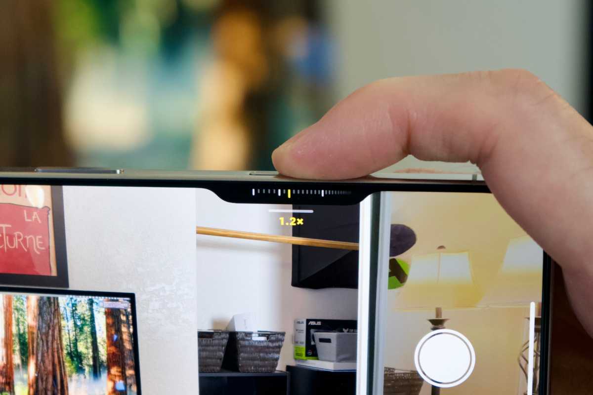
The Camera Control button is arguably the most notable iPhone 16 upgrade. In theory, the new multifunctional button is supposed to cater to photography enthusiasts by offering deep integrations in first- and third-party camera apps. Thanks to its sensitivity toward touch and pressure input, users can adjust the zoom, exposure, depth of field, Photographic Styles, and more. Practically, however, the button overcomplicates everything.
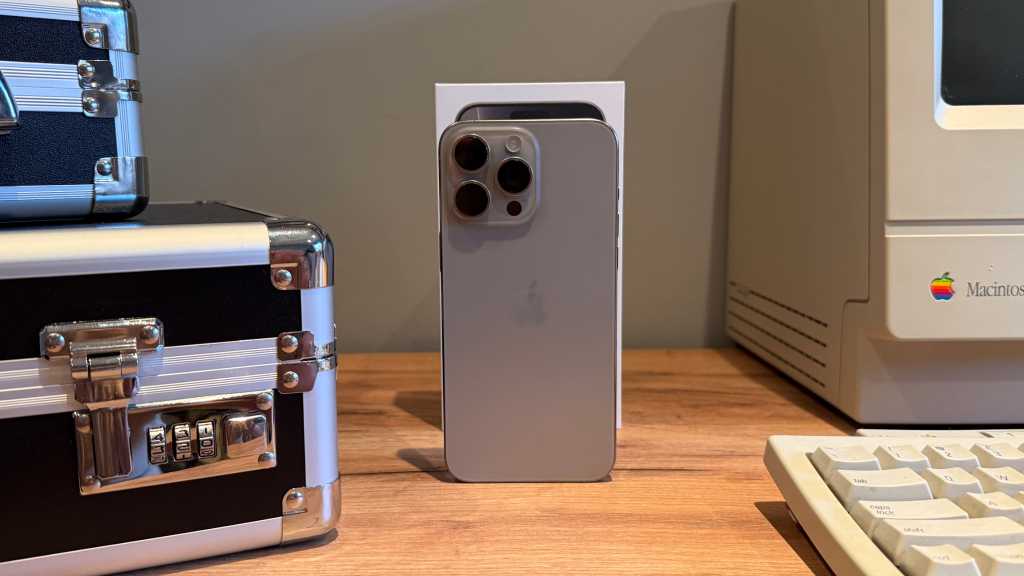
I’ve been really trying to love my iPhone 16 Pro Max’s Camera Control button, but it simply won’t grow on me. For starters, the button is flush with the iPhone’s frame, so identifying it without looking at the phone or touching around is close to impossible. This makes launching the Camera app to shoot a fleeting moment more challenging, especially when compared to the prominent Action button—which I can quickly click as I take the iPhone out of my pocket.

The iPhone 16’s Camera Control button is more trouble than it’s worth.

The iPhone 16’s Camera Control button is more trouble than it’s worth.
Foundry

The iPhone 16’s Camera Control button is more trouble than it’s worth.
Foundry
Foundry
Otherwise, switching between different camera options using the button consumes more time than the existing controls on the touchscreen. And when I’m shooting in portrait orientation without relying on the Camera Control button, my fingers rest on its touch surface, which then unintentionally triggers it and wrecks my setup by changing the zoom, exposure, or lens.
When it comes to finally shooting, the Camera Control button continues to fail as the required firm click shakes the iPhone. This ruins precisely framed photos and makes it harder to shoot moving objects or in low-light environments. Apple could’ve avoided this by assigning the firm click to camera setting alterations, while reserving the light touch input for the shutter. There are ways to change the behavior or disable it completely, but you shouldn’t need to dive into the Accessibility settings just to make a major new feature bearable.
To me, it feels like the Camera Control button is an accessibility feature designed for those shooting with one hand rather than an enticing addition that mainstream users will adopt. Simply put, it creates many problems and solves nothing in the process.
Features upon features
Like the Camera Control button, the Action button (first introduced with the iPhone 15 Pro) also feels like an unnecessary change done for the sake of showcasing a reimagined device. The iconic mute switch survived around 15 years for a reason: it just worked. One could simply identify whether their iPhone is set to silent—without looking at it—by touching its edge. While the Action button can still act as a mute switch, there’s no easy way to identify the phone’s current ringer status without waking its screen and checking manually. It’s not great.
Instead of replacing the mute switch with the Action button, Apple could’ve upgraded the existing double-back-tap feature, allowing users to assign a wider variety of tasks to it. It could’ve served the same purpose without requiring any hardware changes.

The Dynamic Island commands your attention.

The Dynamic Island commands your attention.
David Price / Foundry

The Dynamic Island commands your attention.
David Price / Foundry
David Price / Foundry
This isn’t the first instance of Apple introducing new hardware when iOS changes would suffice. When the iPhone 6S debuted, the company made a big deal out of 3D Touch, only to kill it a few years later in favor of the software-based Haptic Touch.
The iPhone 14 Pro’s Dynamic Island is yet another controversial change that many users I’ve come across despise. While I personally use it every day, others find it distracting. Given that the cutout’s position is lower compared to the retired notch, some users argue that it makes fullscreen videos less immersive.
There’s also seemingly no way to disable Live Activities in the Dynamic Island while maintaining them on the Lock Screen. While you could swipe on it horizontally to hide a certain activity, the action is temporary, and it will default to appearing again when a new session starts. So, those bothered by the flashy pill are bound to a subpar viewing experience that ignores their personal preferences.
And then there are features that exist just to fill out a spec sheet. Take the iPhone Pro’s LiDAR scanner, which allows users to 3D-map their surroundings. While the sensor is nice to have, it feels like yet another unnecessary change introduced for the sake of it. Sure, it contributes to the iPhone’s photography, but rivaling OEMs have managed to deliver great cameras without incorporating LiDAR. Meanwhile, its augmented reality use cases are objectively niche, and I’ve yet to come across someone who actively uses it.
Fewer upgrades, bigger impacts
The annual iPhone upgrade cycle is burning out Apple. As we’ve established, the company sometimes carries out poor decisions in the name of radical change. Otherwise, as was the case with the iterative iPhone 13 Pro, users wouldn’t care as much about upgrading. But what if there was a third route?

Maybe it’s time for Apple to back off annual upgrades.

Maybe it’s time for Apple to back off annual upgrades.
Connor Jewiss / Foundry

Maybe it’s time for Apple to back off annual upgrades.
Connor Jewiss / Foundry
Connor Jewiss / Foundry
Instead of trying too hard to deliver something substantial on the one-year mark, Apple could give itself more time and release a new iPhone every couple of years. Two years’ worth of iterative upgrades bundled into a single device would make it more noticeable—without needing some crazy idea just to generate interest. A report by Mark Gurman suggests that Apple is actually considering moving away from annual launches for some of its products—and the iPhone should be at the top of the list.
This would also give Apple time to actually finish developing the relevant software features instead of selling vaporware. The Camera Control button, for example, is still missing some announced features like Visual Intelligence. Meanwhile, the full Apple Intelligence suite the company has been advertising to sell iPhone 16 units won’t be available until sometime in 2025.
Given the nature of big corporations, shareholders would realistically never let Apple take a break. Consequently, we’re bound to continue witnessing annual releases that are either iterative or absurd—until the iPhone is no longer an iPhone.


