Apple has added a few new features to the macOS Notes app for adding elements to text. Here’s how to use the Notes Attachments Browser.
The Notes app in macOS 15 Sequoia adds some new features, and one of those is a new Notes Attachments Browser.
Notes has long allowed users to add attachments to text notes – namely media such as images, movies, files, maps, and web links.
When you add an attachment to a note in Notes in macOS it shows up as a large thumbnail in the individual Note pane. It’s on the right side of the main window in the app.
If you select a note in the lefthand column in Notes, you can scroll through the selected notes and view all the attachments.
But attachments have been a bit of an annoyance in Notes for a long time. There’s no multiple selection drag and drop, you can only drag one attachment to the Finder Desktop at a time, and there’s no menu command for “Send Attachment to Note” – which would easily allow you to move attachments between different notes.
Scrolling has been a bit of an issue too, with the single note pane bouncing a bit if you add, cut, or reorder attachments by dragging.
Notes Attachments Browser
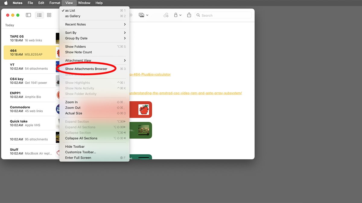
If you select a note on the left in the Notes app and choose View->Notes Attachments Browser (Command-3), the rightmost pane turns into a grid containing all of that Note’s attachments.
The Attachments Browser sorts attachments via a tab bar at the top: Photos, Scans, Maps, Websites, Audio, and Documents.

Surprisingly, the most useful of these is the Websites tab, but it doesn’t sort the displayed web links by category, nor does it provide any subheadings. All the displayed links are tossed in vertical columns.
Worse, there’s no Cut or Delete command either in the Edit menu or in contextual menus when right-clicking an item in the Notes Attachments Browser. When right-clicking an image file in the browser for example, there’s a Copy popup menu item, but not a Cut or Delete item.
We also found a few bugs in the Attachments Browser. The worst of which is if you select an attachment, right-click it and select Show in Note from the popup menu, it often doesn’t take you to the correct note containing the attachment.
This is especially true if your Notes app contains a lot of notes with a huge number of varied attachments, or if you’ve set your iCloud account to be the default Notes app account in Notes->Settings.
It’s surprising Apple would release something in this state. The Notes Attachments Browser is mostly just what it says: a browser – and that’s it. It needs some polish.
It appears the main purpose of the browser is simply to provide a quick view of what attachments are included in Notes. You can however drag a copy of some attachments such as images or documents to the Desktop in macOS from the browser window.
Photos Browser
There’s also a Window->Photo Browser menu item, but it doesn’t have anything to do with photo attachments in Notes. It merely opens a small utility window that displays the contents of your Photos app – from which you can select media.
From the Photo Browser window, you can drag media back into a note in the Notes main window – or to the Finder’s Desktop, which is handy.

Photos Browser in macOS Notes.
Is the Notes Attachments Browser useful? Yes. Does it work the way it should? Nope.
If Apple would refine it and add important commands such as Delete to the browser pane, it would be really useful.
Adding the ability to drag from the browser pane to any note at will would be really cool. It would allow you to transfer attachments from one note to another easily.
But you can’t do that currently because the pane that displays the individual notes turns into the browser pane when you select it from the View menu.
The aforementioned “Move to” menu item for moving attachments and even individual notes into other existing notes would be a huge improvement.
If Apple can think about the design of Notes a bit and make some minor improvements, it will be much better.


