Whether it’s the result of compelling evidence or groupthink, the normally fractious and argumentative Apple rumorsphere has a tendency every now and then to suddenly speak with one voice. And right now that voice is saying four words: HomePod with a display.
Within the space of a week, pundits spotted HomeAccessory17,1 references in backend code and a touchscreen interface hidden in a tvOS beta that all seem to point to the same thing. Whether this will result in a shipped product remains to be seen, but it’s getting hard to deny that Apple is at least working on some form of smart speaker with a screen.
Is this the right move? I’m not convinced. Not because of any nonsense about “if it ain’t broke, don’t fix it:” satisfactory products can still be improved, and in any case, the HomePod has plenty of problems. It’s just that I don’t see how this particular approach will help.
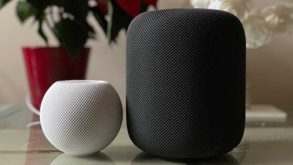
I’ve got four HomePods: a pair of full-size units in the living room, and a HomePod mini in the kitchen and study respectively. I have a love/hate affair with all of them, and I’m struggling to see how a screen will turn the situation around. My issue isn’t that I can’t see what track is playing, or that I can’t play videos or see a read-out of local weather conditions. It’s that the HomePod doesn’t do what it’s told because Siri is rubbish.
Design within reach
A complicating factor is that unlike the iPhone and iPad, which are generally about a foot from our faces, the HomePod’s position relative to the user varies widely from case to case. My living-room HomePods are on either side of the TV, so often I’m facing them; but when I’m actually playing music on them I’m far more likely to be over at the dining table, either with my back to the speakers or far enough away that I wouldn’t be able to see anything on the screens if they had them. The kitchen HomePod mini is over to my right while I’m cooking, tucked behind the spaghetti and a pair of cactus plants, so a screen would be convenient to view but not to use as a touchscreen. And the study HomePod is directly behind me while I work. If it had a screen I’d barely ever see it… although I could scoot over and tap it quite easily.

The HomePod’s current screen isn’t all that useful—and a full touch screen probably won’t be either.
The HomePod’s current screen isn’t all that useful—and a full touch screen probably won’t be either.
Foundry
The HomePod’s current screen isn’t all that useful—and a full touch screen probably won’t be either.
Foundry
Foundry
With that variety of use cases to contend with, the HomePod is a challenge for the designer. If you rely on a touchscreen, just as if you rely on buttons, you’re forcing home workers to get out of their office chairs every time a song or album ends. If you insist on communicating information to the user via a visual display, you’re making them, at minimum, turn to face the HomePod, and since the distance from a user to the HomePod is unpredictable, there’s a good chance your interface text size will need to be turned up so large that barely any information can be shown.
There are two control and informational approaches that make sense for a speaker: either via dependable wireless using your smartphone (which in my experience is very spotty with the iPhone and the HomePod), or audio-based. You know, since it’s an audio-based device. Voice control is a very obvious method to use, since in any context in which you can hear the speaker, it can hear you. Voice suits all of the manifold use cases HomePod owners may adopt.
That’s the approach that Apple tried to start with, and the approach wasn’t at fault; the problem was the execution. Giving the HomePod a screen isn’t entirely unappealing–and it’s a form factor that’s worked well for Amazon and Google–but it doesn’t address the underlying issues that have held the HomePod back. Really it’s a cop-out because it’s creating an entirely new product (which may well succeed) while ignoring the problems afflicting one Apple already has.
What would help is a thorough overhaul of Siri: fix that, and then sure, you can have a screen alongside a voice control system that actually works. How lucky, then, that Apple is currently working on Siri as part of the Apple Intelligence project. How fortunate for us poor long-suffering HomePod owners.
Except that Apple Intelligence won’t affect Siri on our HomePods: not in the initial wave of roll-outs, which will land on the iPhone, iPad, and Mac but on no other Apple devices, and probably not ever because it requires a certain level of processing power. The HomePod-with-a-screen may get a sufficiently powerful A-class chip to run Apple Intelligence some way down the line, but the HomePods we spent $300 on won’t. This is frustrating, to say the least, and reinforces the sense that Apple would rather force customers to buy something new than make the thing they already bought work well.


