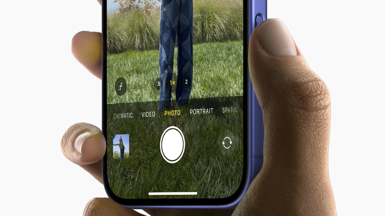
The new Camera Control button

While some may pooh-pooh the iPhone 16 lineup as a boring addition to Apple’s smartphone catalog, many people are excited for one single feature: the Camera Control button. Here’s what Apple designers have to say about it.
Human interface designer Johnnie Manzari and senior director of product design Rich Dinh sat down with Design Tangents to discuss what it took to make the iPhone 16’s new camera a reality. The interview took place in Apple’s own podcast studio in Cupertino following September’s “It’s Glowtime” event.
Much of the interview centers on discussing Apple’s design philosophy and how designers figure out what makes the cut and what doesn’t.
“I think sometimes people think we have a recipe that we’re trying to adhere to when we make these devices, when we think of these devices, and we really don’t,” Dinh says. “We really set off focusing on the customer experience, not trying to make new hardware, not trying to make new software, but really how do we move that customer experience forward and using your iPhone.”
And that philosophy is reflected in the new iPhone 16 Camera Control button. Dinh points out that the button was designed to be somewhat inconspicuous, sitting flush against the device.
“…So, for day-to-day use we’re hoping that the phone feels very much like your phone today in terms of how you grip it and handle it, but we’ve added a little chamfer in there to give that really lovely half press and full press experience with the button flush,” he says.
And by designing a button that could detect both full- and half-presses, the designers realized that they could embrace the playfulness of a dedicated camera button.
“The idea that by lightly pressing on the button, you could signal to the phone that you were intending to take a capture,” Manzari notes. “That led to all sorts of interesting new experiences that we started to design.”
Intentionality is another thing Apple prizes. The moment you press the camera button, the interface clears, allowing for better composition of designs. This intentional removal of distractions is something the design team was most excited about.
“I’m probably more of the prosumer level photographer and being able to have Zoom control on your fingertips and have the screen really free of any obstruction to what you’re composing and what you’re seeing,” Dinh notes. “You’re making these videos of family, friends, kids, whatever, and it feels cinematic.”
And, to give credit where credit is due, the pair notes that the camera button wouldn’t exist without extensive collaboration across teams.
“… It’s work from across the whole company, the sensor team, passing that information down into the architecture stack. And then on the design side, just trying to understand how would a professional do this? How would they do the ramps? And pulling it all together,” Manzari says.
“And again… hopefully, people don’t have to think about any of this. They’re just getting the video that they want of their friends and family, but it’s really built off this really deep collaboration across the entire company.”


