It’s been more than a year since Apple Watch Ultra 2 launched, and we’ve had the wearable that’s only gotten better on our wrist the whole time.
I do these extended long-term reviews often on Apple products, often by the time a new model has launched. I see how my opinions have changed with extended use and whether or not it was and is worth buying now.
If this was like any other year, I’d probably have the Apple Watch Ultra 2 on one wrist and the Apple Watch Ultra 3 on the other – but not this time.
Instead, Apple opted to keep the Apple Watch Ultra 2 around and updated it with what amount to new hardware-specific features, and even gave us another colorway.
It’s kind of wild and frankly, a great value for this product. It’s a pattern for Apple recently with its wearable products.
AirPods Pro 2 have been continuously updated with new features, rather than Apple just rolling out new iterative new models and convincing people to upgrade.
If you bought one a year ago, it got even better. And if you are just now picking one up, as many are, you have some good idea at how it performs.
Apple Watch Ultra 2 long-term review: My go-to watch
I’ve been wearing the Apple Watch Ultra 2 basically every day for the past year. Only recently has that changed — more on that soon.
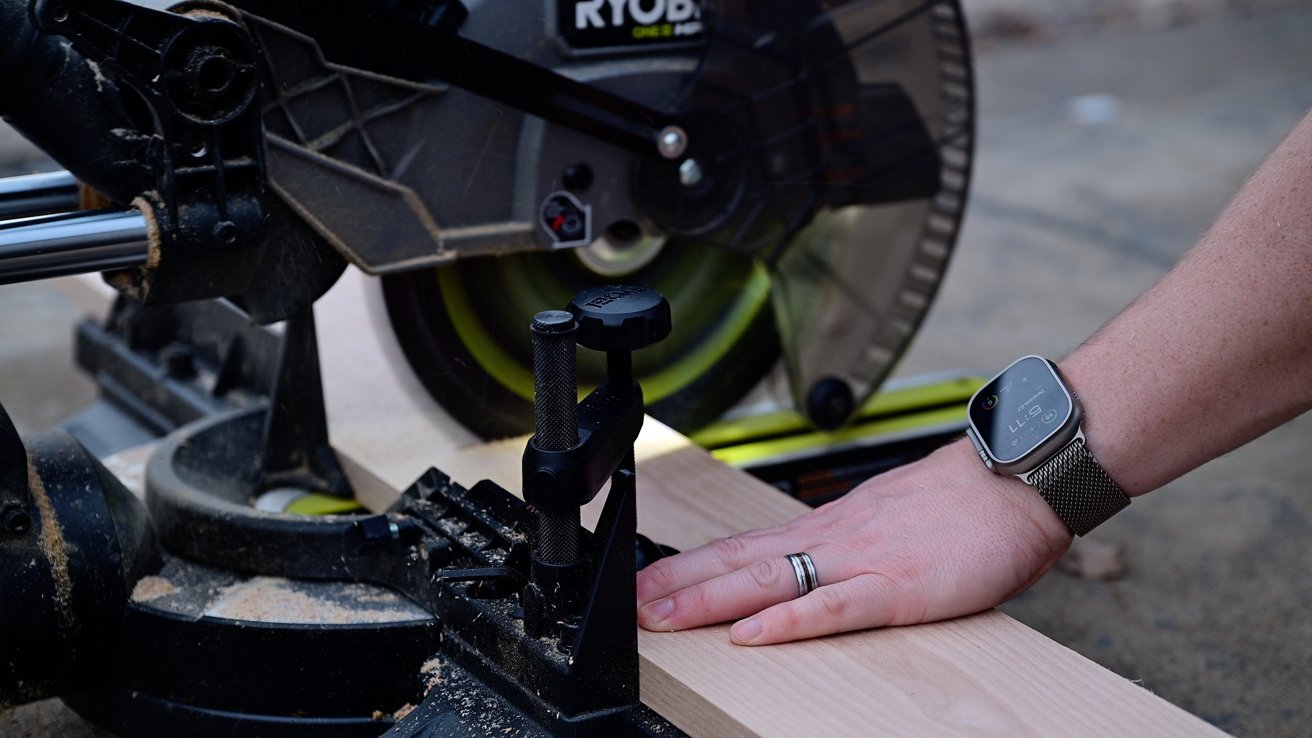
Apple Watch Ultra 2 long-term review: It’s been through some stuff
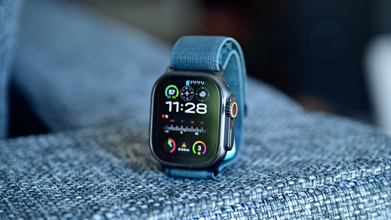
It’s got a completely flat sapphire glass display with the vivid, Ultra Orange Action Button on one side and the rugged Digital Crown and side button on the other.
It’s a 49mm display which was, until recently, the largest display on an Apple Watch. Despite the Series 10 technically having a larger display by area, Apple Watch Ultra still has its own exclusive watch faces.
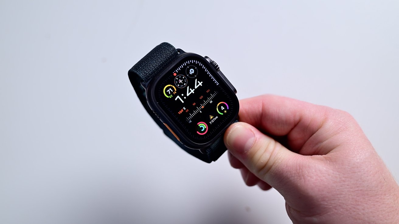
Apple Watch Ultra 2 long-term review: The Modular Ultra watch face
Modular Ultra is probably my favorite for the Apple Watch Ultra. It takes advantage of all the space and has a ring around the edge that updates in real time to different metrics.
You can change that edge animation to show your current elevation, the depth, or the second hand. I usually use it as a way to keep track of the second hand.
As I mentioned, the Apple Watch Ultra got a new color choice. It now comes in a black titanium which is the only physical change from the version that launched in 2023.
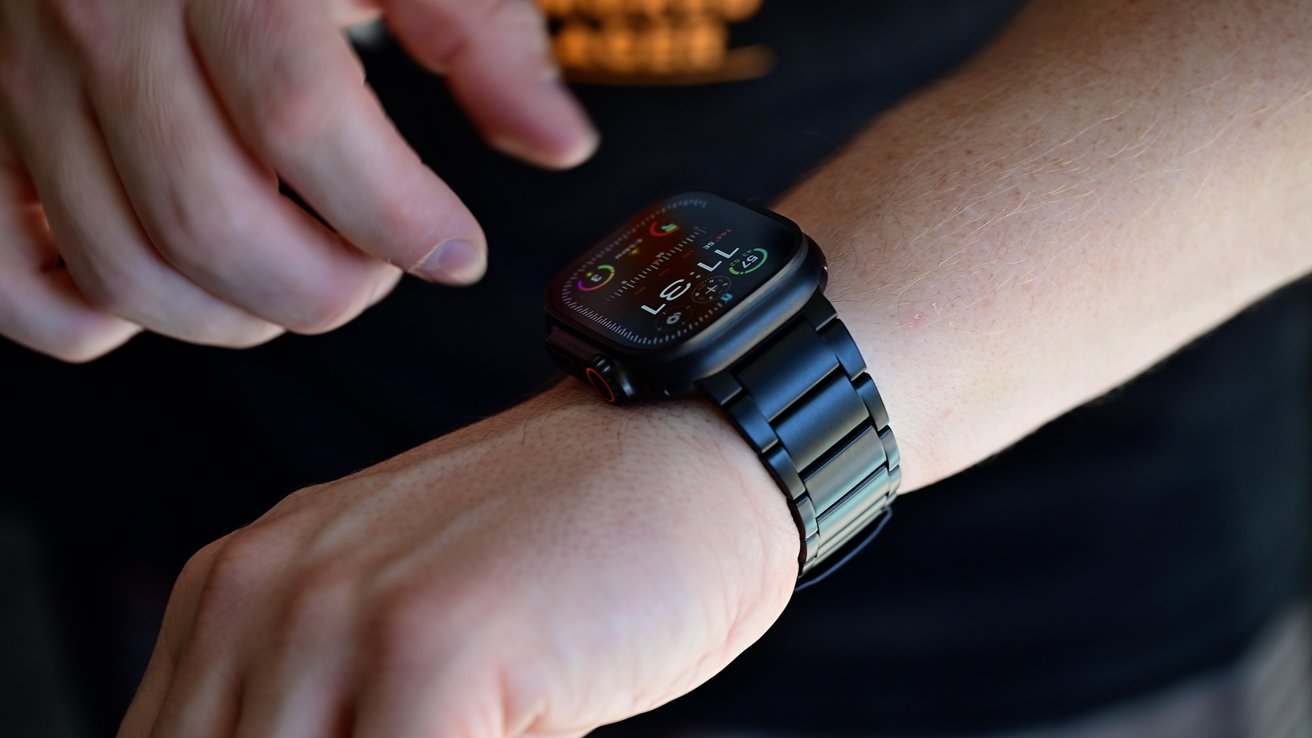
Apple Watch Ultra 2 long-term review: Wearing the black Apple Watch Ultra
Personally, I think the black looks great. It looks premium and sleek and I can see why so many people have made the jump to it.
I think the orange accents look even better with this color too. Early users have also reported that the color doesn’t easily come off either.
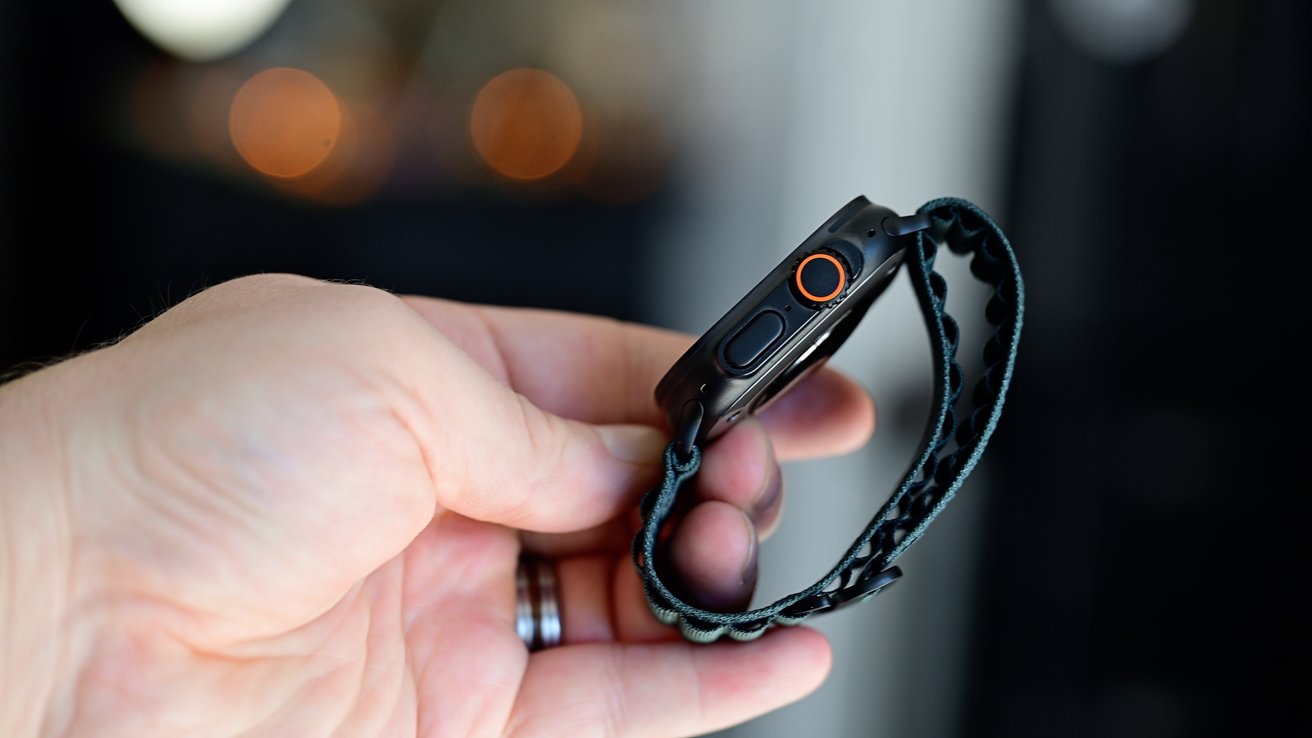
Apple Watch Ultra 2 long-term review: The new dark green Alpine strap
Is it enough that you’re going to upgrade to it from your natural silver titanium Apple Watch Ultra 2 – no, but if you were in the market, it can tip the scales for sure.
Otherwise, it has the same sensors Apple has kept for the past few years in its watches. Heart rate sensor with the ability to take an ECG, accelerometer, gyroscope, and more.
Apple Watch Ultra 2 long-term review: What works and what doesn’t
I’ll admit, I don’t use the Action Button much. I wanted to, ever since it launched on the original Apple Watch Ultra.
I just forget it exists a lot of the time. No matter what I set it to — flashlight, shortcuts, stopwatch — I neglect it.
There are those that do regularly use this, I’m sure, but it was never a hit with me like I thought it’d be. I use the Action Button on my iPhone far more frequently.
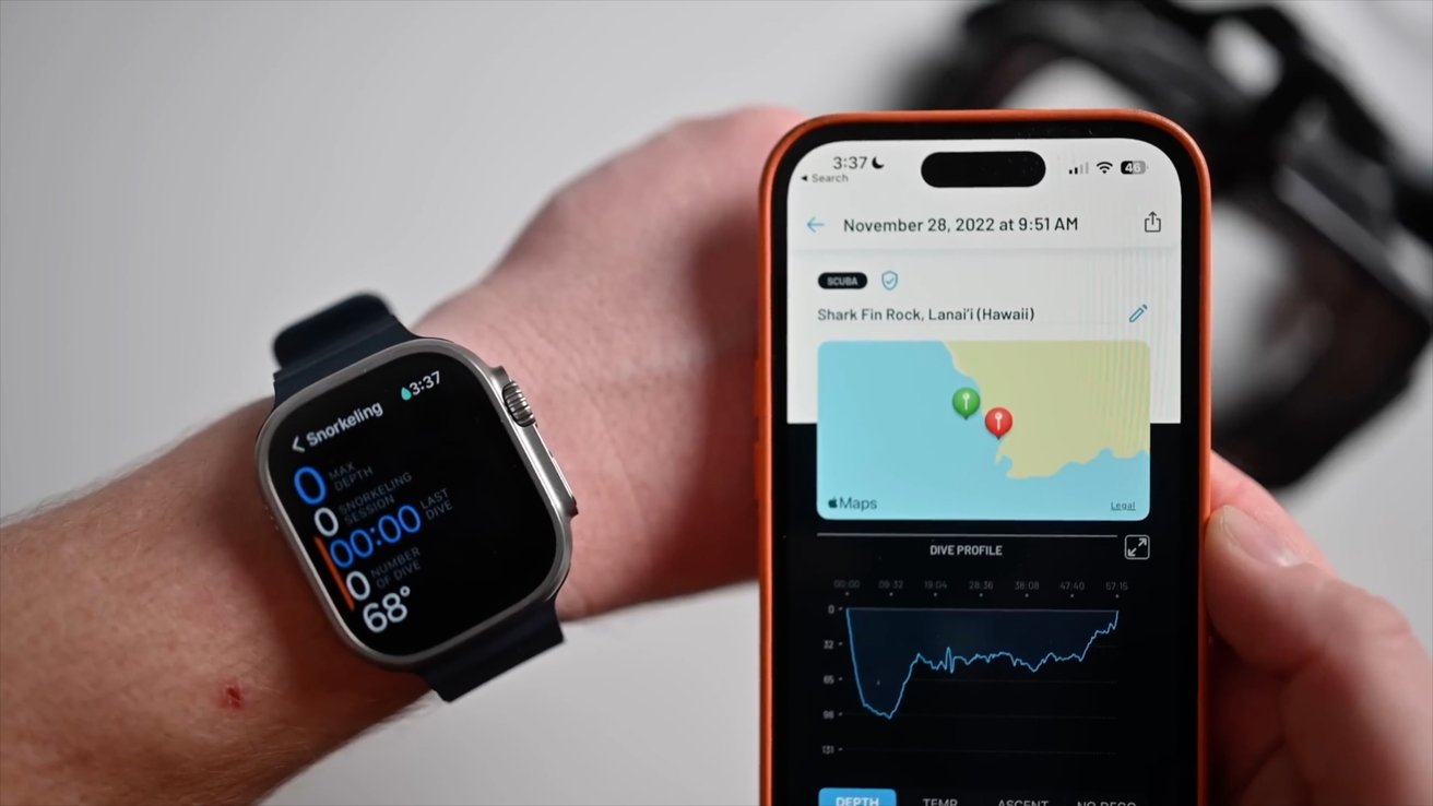
Apple Watch Ultra 2 long-term review: I want Apple to make a diving app
Another unique feature of the ultra series is support for recreational diving. Free diving, scuba diving, or even snorkeling.
As a scuba diver, this feature had me overjoyed to see. It’s fantastic to see recondition for diving in a major flagship product such as this.
The reality is though, living in landlocked Ohio, I don’t get to dive nearly as much as I want to. I’ve only managed to use this feature a few times.
Those times though, it worked great. I loved not having to switch to a different dive watch.
That said, the same issues are here that were here with the first Apple Watch Ultra. I’d love to see an Apple-designed dive app that doesn’t carry the monthly fee and it needs a way to integrate with air transmitters.
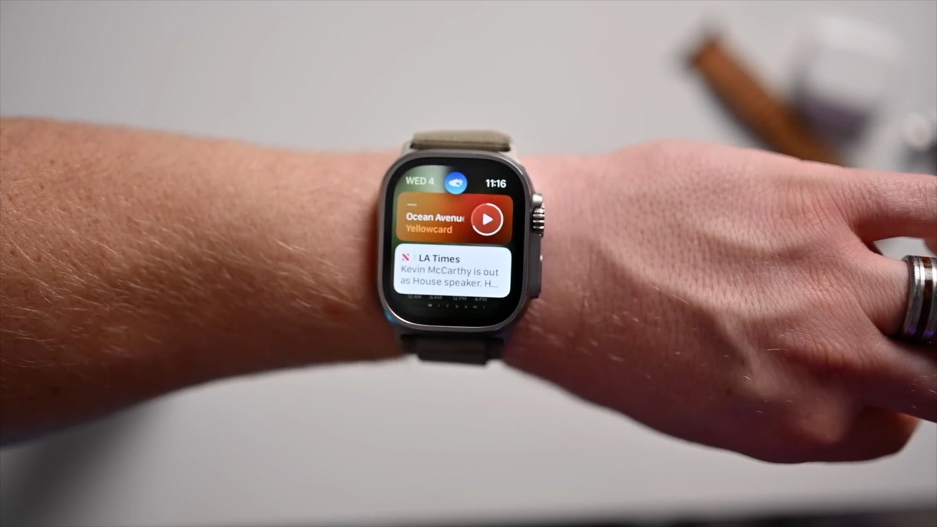
Apple Watch Ultra 2 long-term review: Using Double Tap to scroll the Smart Stack
Specific to the Apple Watch Ultra 2, Apple Watch Series 9, and Apple Watch Series 10 is double tap. It’s a one-handed way to interact with your watch that was born out of an accessibility feature.
Like with the Action Button, I was very slow on the adoption here. Eventually, I realized how useful it had become.
For the first few months, I forgot about it entirely. Then I started using it to control music playback, answer a phone call, or start a response to a message.
I knew I started to become hooked on the feature when I’d go back to using my Apple Watch Series 7. I’d try to use double tap and nothing would happen — for obvious reasons.
With watchOS 11, double tap became even more powerful. It was integrated into more of the stock apps and third-party apps also are now available to integrate it as a primary function.
Apple Watch Ultra 2 long-term review: What watchOS 11 brings to the table
It’s only been about two months since watchOS 11 was released but I’ve been very impressed by it. It surprisingly became one of the biggest updates to the Apple Watch.
Apple announced watchOS 11 at WWDC in June with its other software. I thought we knew everything that was coming in this update, but then Apple announced several more at its September event.
Specifically, Apple used it to bring speaker playback, sleep apnea detection, and the Tides app to the year-old Apple Watch Ultra 2. Instead of covering everything in this update, I wanted to focus on these late additions.
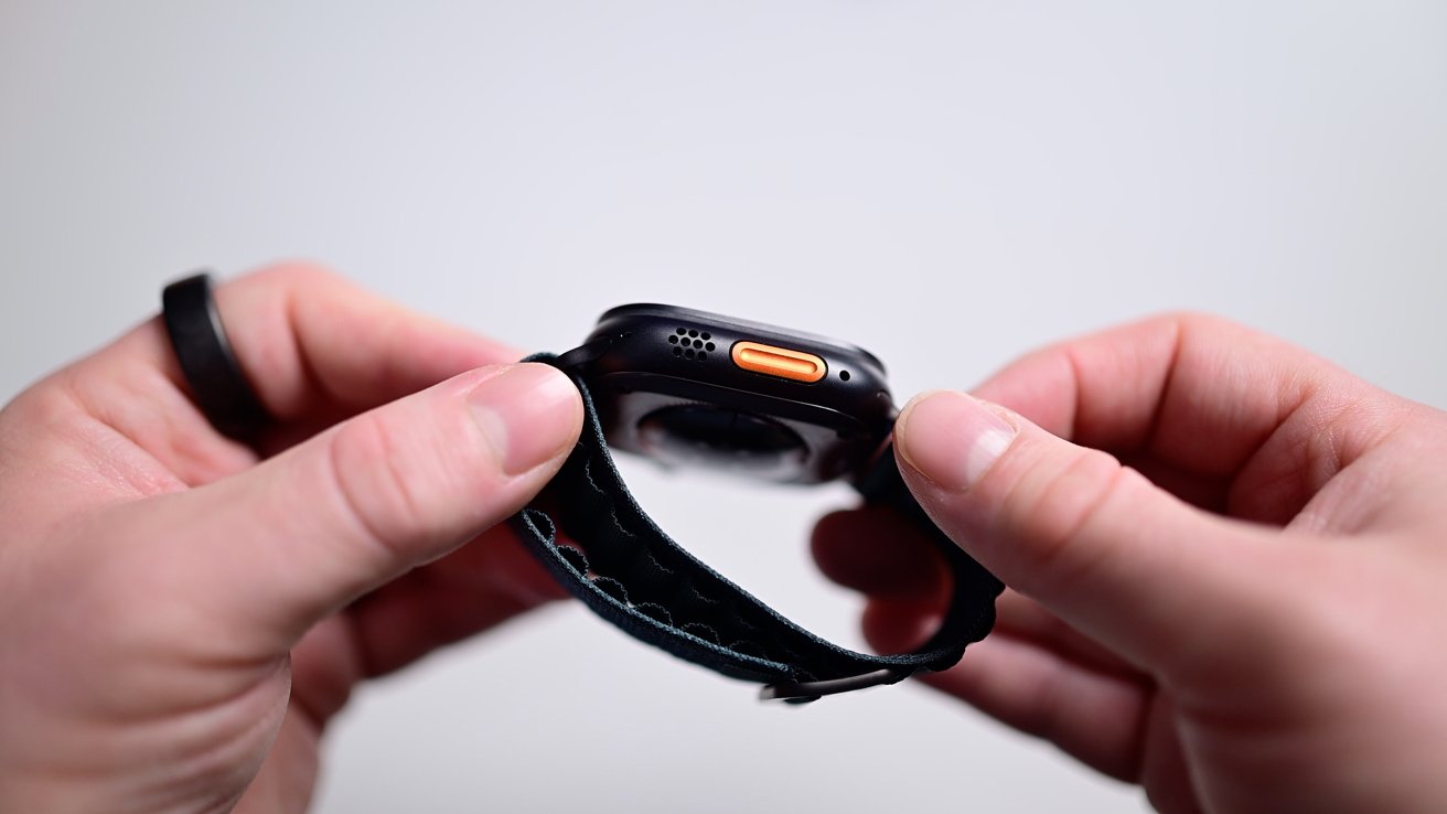
Apple Watch Ultra 2 long-term review: The speaker grille can now be used for music, podcasts, and audiobooks
Speaker playback is fantastic. It’s something I’ve wanted for ages on Apple Watch and never understood the needless limitation.
I don’t always have my phone or headphones with me. Whether I am working out, working in the yard, or cleaning the chicken coop.
What I do have, is my Apple Watch. While in my yard, for example, if I tried to play audio on my phone, I’d need to find a good place for it.
It can’t go in the sun or it will overheat. Plus I’m always moving or carrying things which makes a phone harder to use as a speaker.
Sure, I could bring an actual Bluetooth or AirPlay speaker but that’s an extra device to worry about. With this, I can just start a playlist or a podcast right on my wrist.
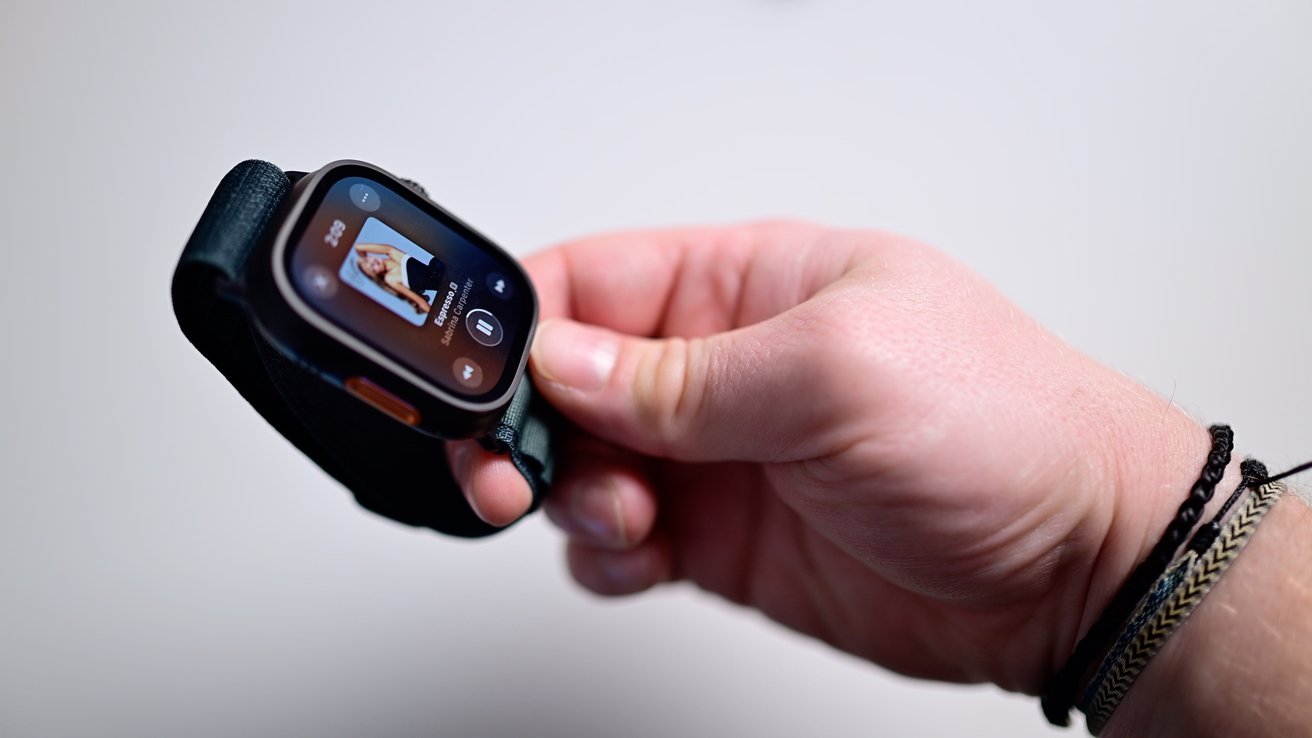
Apple Watch Ultra 2 long-term review: Play music on Apple Watch through the speaker
It’s not exceptionally loud by any means, but it’s loud enough. It’s just nice to be able to use the speaker as an actual speaker and not just for calls.
Then there is sleep apnea detection. It’s a full FDA-certified test that monitors you throughout the night as you sleep.
![]()
Apple Watch Ultra 2 long-term review: Vitals app tracks your health overnight
The number of people that will gain insight here just by wearing a device they may have had for over a year already, astounds me.
I’ve done a full at home sleep test with all the wires, and this would have been way nicer, easier, and cheaper. I’ve already been wearing the watch to bed for sleep tracking as-is.
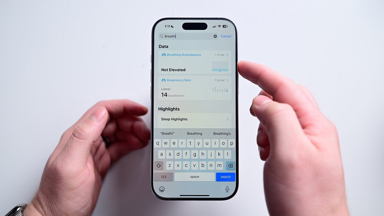
Apple Watch Ultra 2 long-term review: Breathing disturbances represent possible sleep apnea
So far, the Health app reports minimal breathing disturbances for me, which mirrors what my traditional test said. This can change over time though, so it’s nice to have a constant background monitor going on.
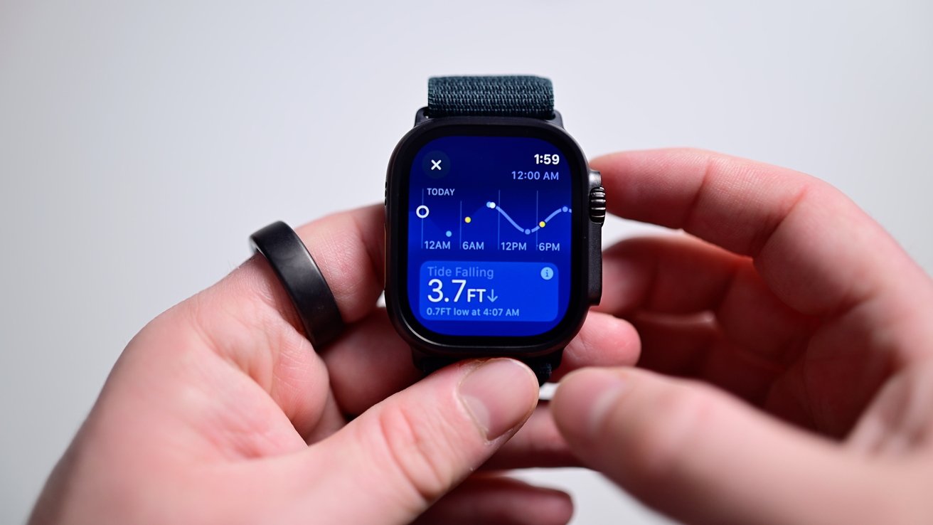
I have little to say on the Tides app. It’s a nice addition, though I imagine more-so if you live along a coastline.
Apple Watch Ultra 2 long-term review: There’s something missing…
When it comes to comparing the Apple Watch Ultra 2 now to when it launched, almost everything about it is better. Except for one thing — the blood oxygen monitoring.
Technically, the watch still has the requisite hardware – Apple never changed that – but after the end of last year, no newly-shipping models could include the feature.
Apple updated watchOS to remove the blood oxygen app on any watch sold after the deadline after it lost its case in court. That means you can’t do on-demand measurements and the Vitals app won’t record it overnight.
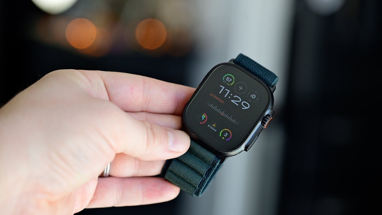
Apple Watch Ultra 2 long-term review: The Apple Watch Ultra 2 in black
It’s painful for consumers who just want this health feature but are caught up in the middle of a patent dispute.
Masimo, the holder of the infringed patent, did just lose its CEO so maybe we’ll see some changes in their ongoing relationship with Apple.
I think Apple will add this feature back the second they’re able to. We just don’t know when or if that will happen.
Apple Watch Ultra 2 long-term review: The killer feature
For me, the biggest killer feature for the Apple Watch Ultra 2 is the battery life. It’s fantastic — at least for an Apple Watch.
I can regularly go a couple days without charging. I never had to worry about it.
At the beginning of this review I said I’d been wearing the Apple Watch Ultra 2 daily, until very recently when that changed. The reason why is because I’ve switched to the new Apple Watch Series 10.
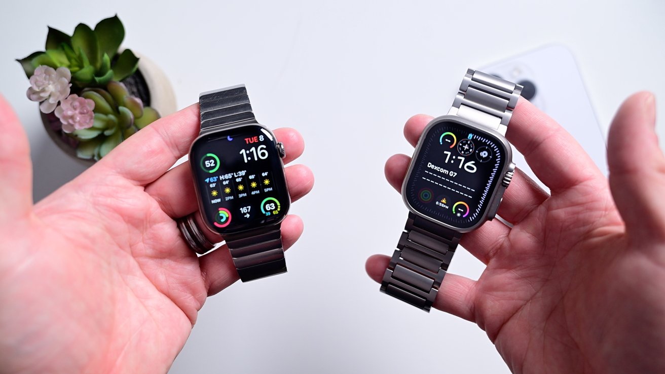
Apple Watch Ultra 2 long-term review: The Apple Watch Series 10 (left) and Apple Watch Ultra 2 (right)
The new sleeker design had me sold, plus the new polished titanium body. It looks beautiful to me over the sharp edges of the Ultra 2.
Unfortunately, the battery is still so short. Especially coming from the Ultra 2, having to charge every day feels laborious.
If we are having a night out, I better charge earlier in the day because I’m not making it until 2 in the morning. Sometimes I end up having to charge in the mornings too.
But when I wear the Apple Watch Ultra 2, it’s a non-issue. I placed it on a charger whenever was convenience, roughly every 2-3 days, and I was fine.
I still move between the Apple Watch Ultra 2 and the Apple Watch Series 10 and if there was ever a singular feature that would draw me back to the former, it would be that battery life.
Apple Watch Ultra 2 long-term review: No Ultra 3 this year is OK
I know some people were disappointed there was no Apple Watch Ultra 3 — at least not yet. But I think what Apple did was even better.
It updated its existing model with big, impactful new features for all its existing users instead of locking them behind a very small update.
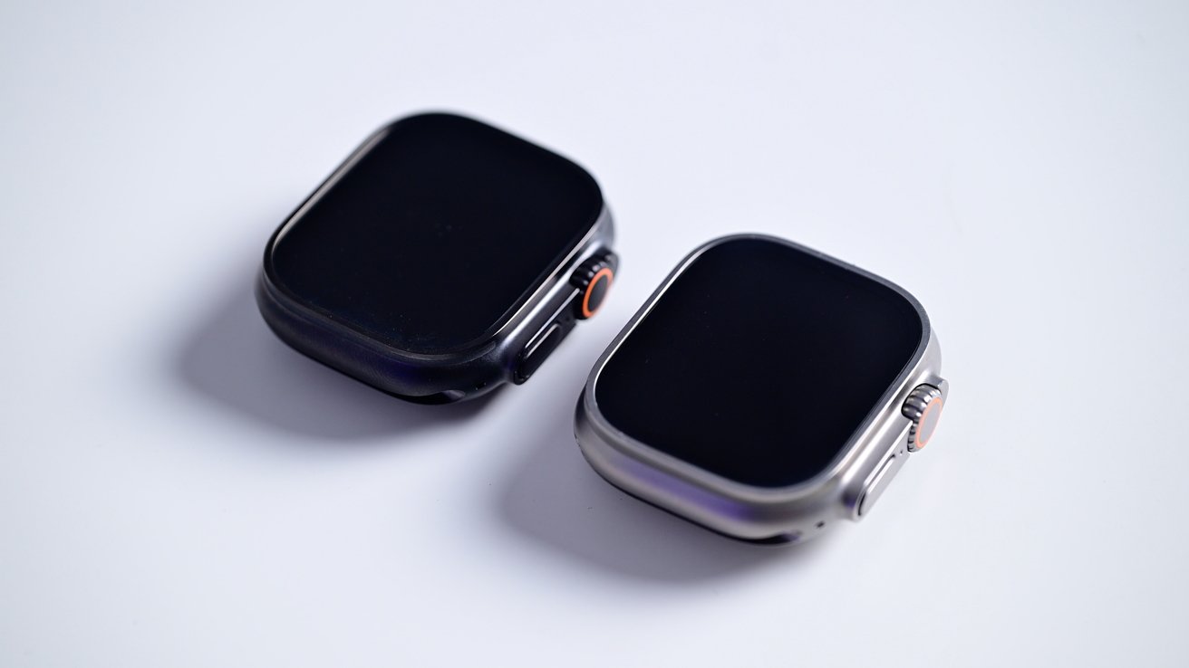
Apple Watch Ultra 2 long-term review: The natural versus black Apple Watch Ultras
Apple could have kept sleep apnea, speaker playback, maybe even the Tides app, and the black color for an Apple Watch Ultra 3 and put in a mildly faster chip.
That version of an Apple Watch Ultra 3 probably would have sold just fine. Instead, we all get those features without buying a new model.
I’d have said that this watch is still worth buying after a year of using it, but adding on the new features and offering up a new color, I’d say it’s an even better buy.
Plus, next year, if we do get that Apple Watch Ultra 3, it’s going to be an even bigger leap forward.
Apple Watch Ultra 2 long-term review: Pros
- New black color is stunning
- New band options looks great
- Surprise new feature breath fresh life into the year-old device
- Battery life is the best in the Apple Watch lineup
- Sleep apnea will help countless users
Apple Watch Ultra 2 long-term review: Cons
- SpO2 is still missing
- Diving needs more depth, a first party app, and air integration
Apple Watch Ultra 2 long-term review: 4.5 out of 5
Where to buy the Apple Watch Ultra 2
The Apple Watch Ultra 2 is on sale now, with discounts on even the new black colorway. You can find the lowest Apple Watch Ultra 2 prices in our Price Guide, along with deals across Apple’s entire wearables line in our Apple Watch deals roundup.


