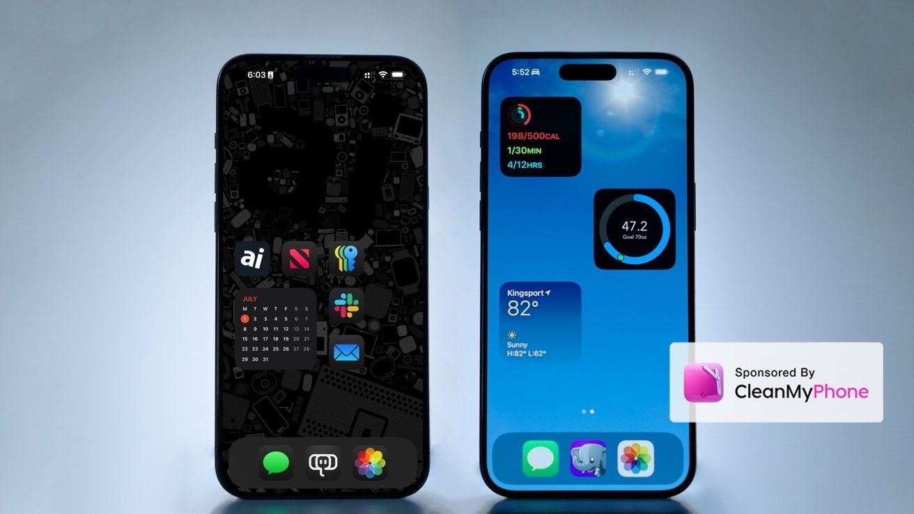
iOS 18 review

Apple did something unexpected with iOS 18 across nearly every feature outside of the anticipated Apple Intelligence — it listened by offering more customization and control.
It is no secret that investors and pundits were clamoring to know more about Apple’s AI plans. However, now that we see Apple Intelligence will be a slow launch mostly limited to new hardware, it is clear why iOS 18 is so much more than AI.
When the Android vs iPhone wars were at their peak in the 2010s, you likely heard that one of the biggest reasons to choose Android was customization. Apple’s simple grid of icons was laughable to the amusement park that was Android home screens.
Blame industry trends or Jony Ive leaving, but Apple finally gave way to giving users something they had never given them before — options. Alternate app icons opened the door to the idea that an iPhone could be personalized.
While Apple Intelligence appears impressive in some aspects, it isn’t available to test. So, this review will focus on iOS 18 outside of AI, especially since this will be how iOS looks to most people around the globe anyway.
And funny enough, it seems nearly every feature has something to do with personalization.
iOS 18 review: customization upgrades
Apple has handed out a slow drip of customization features since iOS 14 introduced widgets on the Home Screen. Every update since has placed more emphasis on custom layouts, controls, and themes until what seems to be the pinnacle of iOS 18.
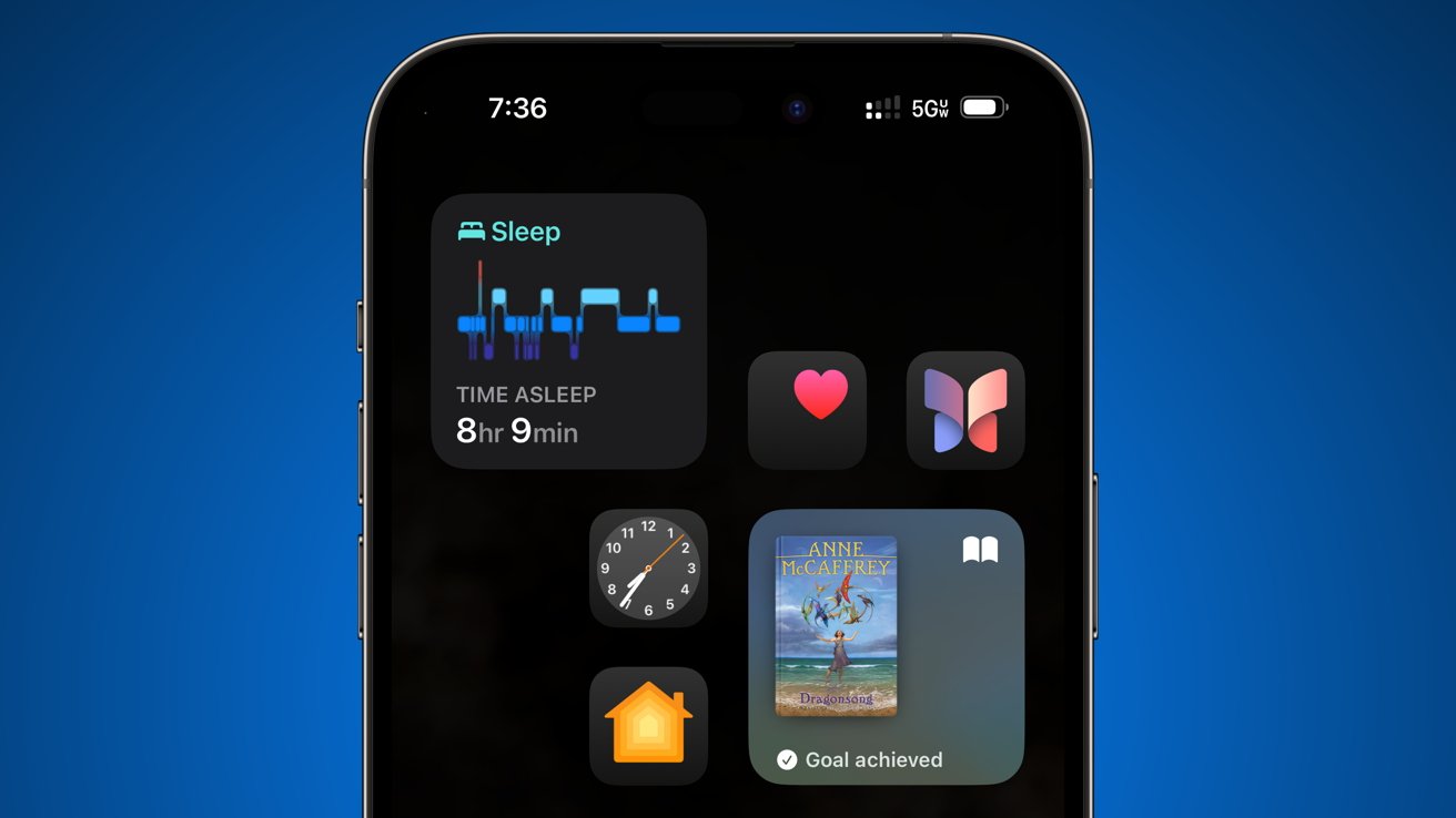
iOS 18 review: customization gets an upgrade with dark icons and blank spaces
It isn’t just about negative space on the Home Screen or tinting icons — it’s about control. Combine interactive widgets, custom icons, negative space, custom Lock Screens, wallpapers, and Focus Modes, and you get a device that is truly yours in any and all contexts.
Even outside of launching portions of the operating system like the Home Screen, Lock Screen, and Control Center, Apple has looked for more ways to customize the user interface. For example, Safari has Tab Groups and Profiles that change with Focus modes and can offer different Start Pages for each.
Customization is taken a step further with Photos in iOS 18, where the user can configure the app’s layout. Different albums and smart groups show up in the interface, new ones can be created and added, and it results in a highly controllable interface.
The only thing missing from app icon tinting and the new Photos apps are Focus Filters. Imagine entering a Work Focus where Photos only shows albums related to product photography, screenshots, and other relevant work based on collections you’ve curated.
Let’s get into the specifics of these updates.
Home Screen & Lock Screen
Apple’s Home Screen has several new options for user customization. They include the ability to leave blank space on the Home Screen, adjust icon sizes, switch to dark icons, or add a tint.
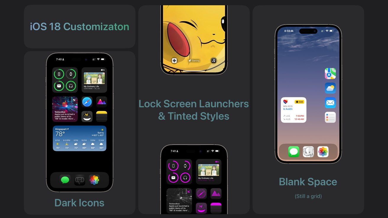
iOS 18 review: Lock Screens and Home Screens get more customization options
When customizing the icons, they affect every icon including those shown in the App Library, folders, and Spotlight search. It is a setting that is locked in no matter what Focus is active, for now.
Users have been requesting the ability to add blank space for years. Apple pitched the feature as a way to uncover parts of a wallpaper, like a pet’s face.
App icons can also be set to a large mode that hides the text labels on icons and widgets. The labels disappear from everywhere, so it might be difficult to identify some apps in the App Library if you don’t have the icon memorized.
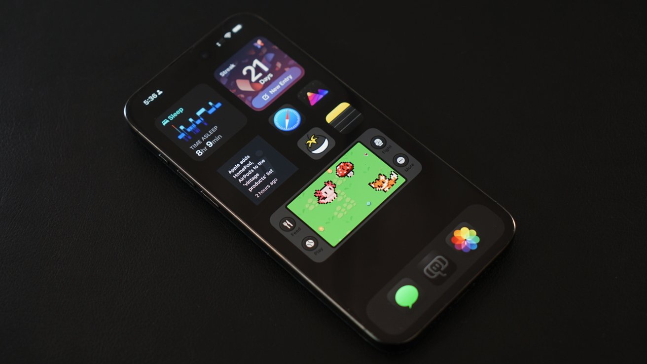
iOS 18 review: embrace dark mode with dark icons and dimmed backgrounds
Dark mode icons are a new feature that swaps the color palette of glyph-style icons to one with black backgrounds and dark accents. Apple’s app icons have never offered alternative icons until now, and the change is striking.
Third-party apps that don’t have complex colors or designs in the foreground or background are algorithmically darkened too. It can lead to some interesting results, but since Apple is forcing the change, developers will need to optimize icons or be left with subpar dark icons.
Purists who wanted dark mode and themes were left with bright white icons from Apple. It necessitated creating custom launchers with Shortcuts to get appropriately themed icons.
Shortcuts and widgets were also used to theme the Home Screen, but Apple has made it much easier with iOS 18. The tinting option automatically sets icons to dark mode and then applies a color filter to elements of the icon.
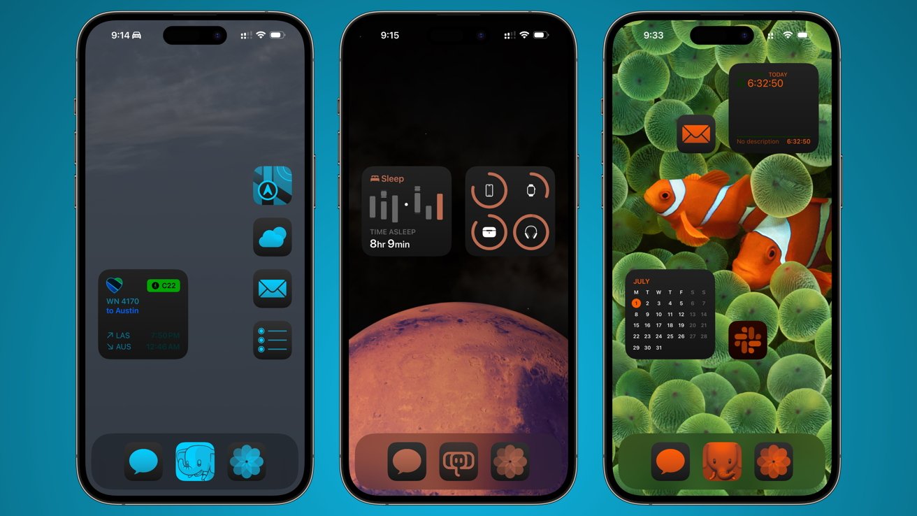
iOS 18 review: tint icons and widgets to achieve a more uniform style
It appears to be a rudimentary implementation at first glance since it is a brute-force application to all icons and widgets. However, Apple has given developers the ability to submit layered icons to take advantage of the filtered mode specifically. We’ll have to evaluate how that looks in the fall.
Dark and light icons can be set to automatically switch based on time of day, similar to system-wide light and dark mode. Also, there’s a sun icon that can be used to dim the wallpaper.
Apple didn’t change much about the Lock Screen, but what it did change is significant. The flashlight and camera buttons have been on the Lock Screen since iPhone X, but they’re now user-replaceable.
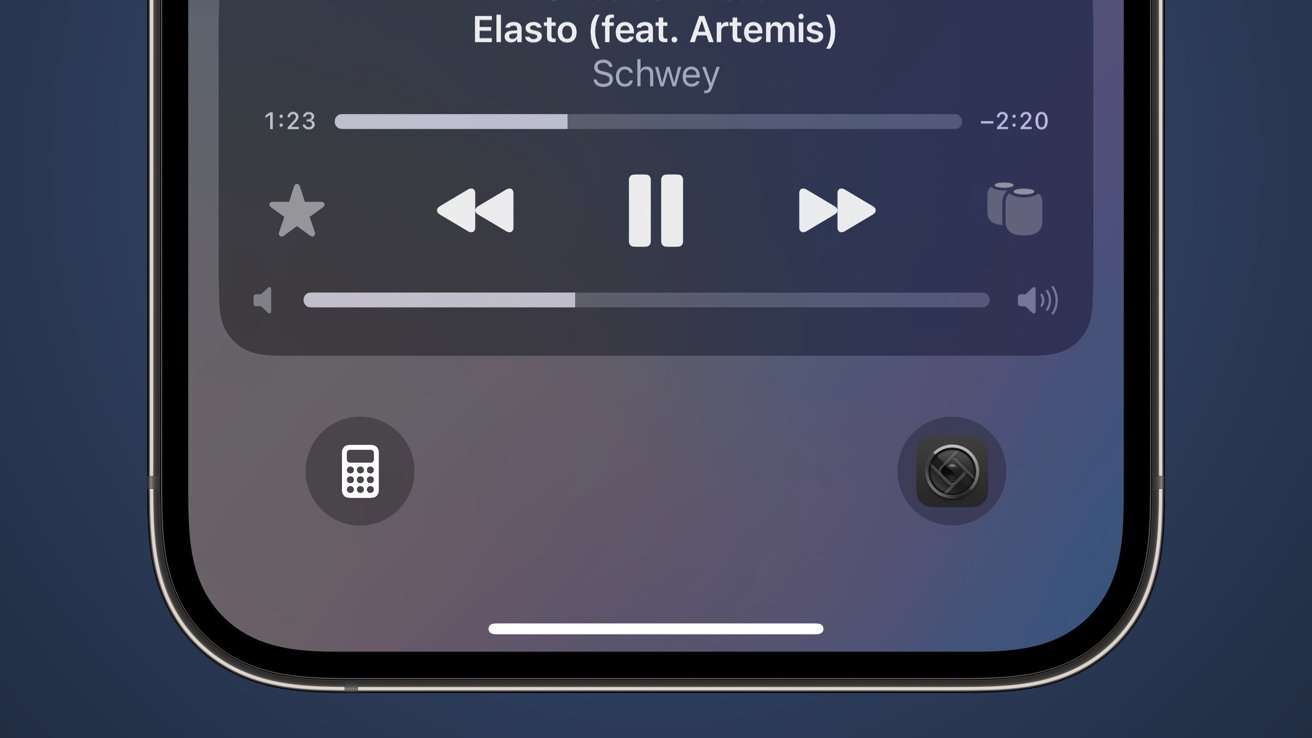
iOS 18 review: change the Lock Screen shortcut buttons
I’ve had some trouble with this update because I always want the flashlight there, and muscle memory has me ruined on the camera button. I tried Halide in the camera slot, and it became a task to remember which camera app I wanted and when.
After I break the muscle memory, I expect things will be better. One option is to make the button a Shortcut, which could then run an action menu.
Thankfully, the button customizations are tied to Lock Screens, which means they can change with Focus. Still, it’ll take a while to find what I want to be different there if anything.

Control Center
Control Center has been rebuilt as a multi-page user-customizable tool. It can include multiple sizes of icons and controls for system features and third-party apps.
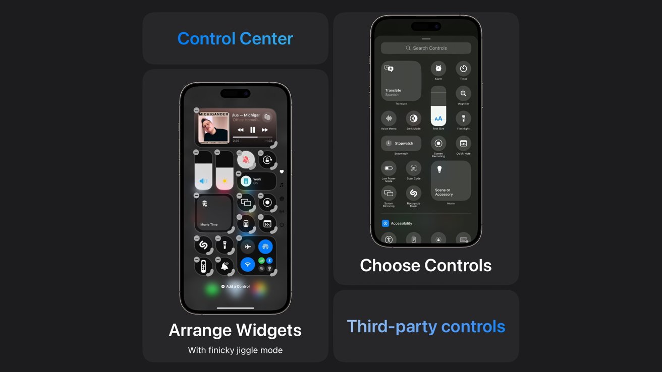
iOS 18 review: Control Center is customizable and can extend to multiple pages
It feels a little redundant to have a Home Screen, Lock Screen, Today View, and now Control Center with ways to access information and controls. However, Control Center stands out as a unique addition to the customization game since it is always a swipe away.
Reorganize system controls to your heart’s content. Change the size of a widget to take up a single block or an entire page, depending on the control.
Once you’ve filled a page, a new one can be created up to 10 pages. Reaching these pages isn’t a chore since you can swipe down from the top left and continue sliding in one motion until the desired page is reached.
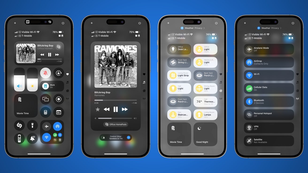
iOS 18 review: Control Center can be organized to suit the user’s needs
It is quite a compelling upgrade, even without access to third-party apps during the beta. It’ll be interesting to see PCalc as a launcher option or other unique controls provided by various apps like Widgetsmith.
Once you’ve packed a page full of controls, it can become quite the sliding tile puzzle trying to get everything in its place. Jiggle mode is as infuriating as ever when you’re trying to organize a single icon into a row of other icons that can potentially blow up your entire page.
And there’s no undo button. Adding an undo button would make editing these pages much easier.
iOS 18 review: updated Apple apps
We’re over 1,000 words in and haven’t made it to feature updates just yet. That’s how big the customization updates are.
Apple didn’t stop there, though. Its various system apps and services have also been updated for iOS 18.
Photos
Apple redesigned the Photos app by removing its tabbed interface in favor of a unified one. The single view can be a bit overwhelming at first, but it does offer some useful organization and customization.
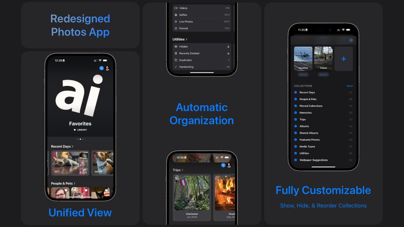
iOS 18 review: Apple introduced an all-new Photos app
Anecdotally, I’ve encountered people who have no idea what the Photos app does beyond showing a list of photos in capture order. The other pages were left neglected unless they needed to recover a deleted image.
The unified design brings everything to the front, which should help surface some functions that were hidden before, like the Memories or Map features.
Swiping on the main library view brings up custom memories and collections. Below that is a series of different sorting options based on faces, pets, trips, albums, and more.
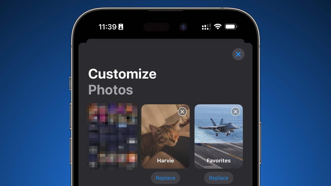
iOS 18 review: Organize the Photos app unified view to suite your use case
Everything that was in the previous Photos app is still here in iOS 18, but it just might take some getting used to the new interface. Customizing it is key to getting it right, though it does feel like the options are limited for now.
I’d love to see Apple bring Focus Filters to the Photos app. Allow me to show screenshots and documents in the Work focus, show people and places in Personal, and show food in Fitness.
Safari
Safari has a new Highlights feature, and Reader view has been upgraded. Highlights can provide quick links to Maps, Music, or other apps that surface from the current webpage.
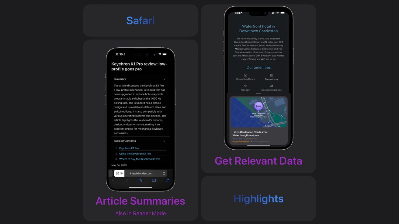
iOS 18 review: Safari gets a new Highlights feature with summaries and quick links
If you go to the new Reader view, it can provide a summary of the page and offer a generated table of contents. The summary is shown in the Highlights view, and Reader view when available.
Apple Intelligence isn’t required for the new Safari features to work. They pull information using data detectors for map links, dates, music, and more.
So far, I have seen Highlights, summaries, and tables of contents on select older webpages. They are interesting tools that could help users browse the web without trying to destroy it.

Journal
Journal upgrades include a new search tool with filters and insights. These are welcome updates after a relatively stale initial launch with limited options.
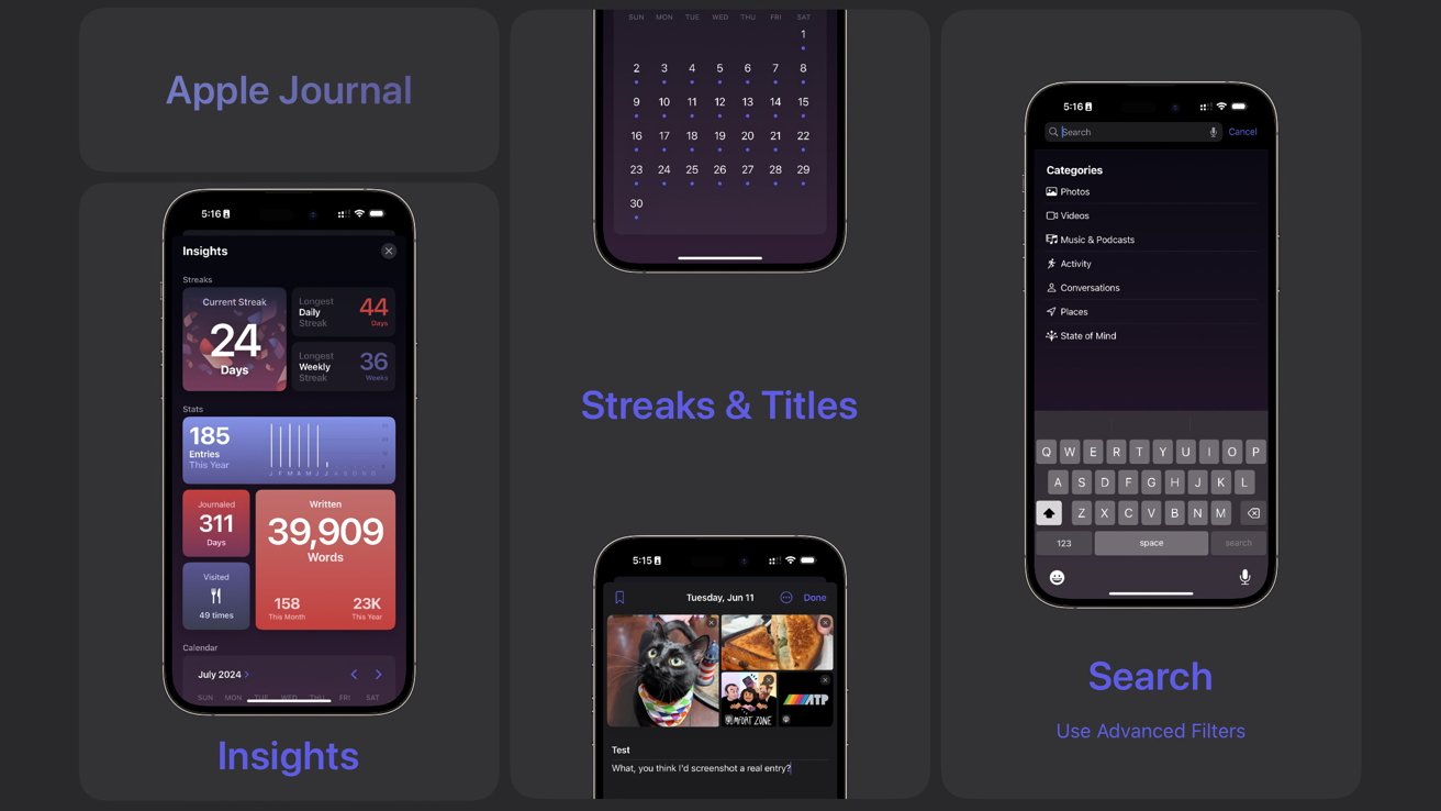
iOS 18 review: Journal gets a big update with streaks and search
The journal entry process hasn’t changed. Users still tap a giant plus button to add text, images, or suggestions to an entry.
An excellent addition is the ability to tie Journal to Apple Health. Every minute in Journal is logged as mindfulness minutes, and users can log State of Mind in line with the entry.
The search button in the top right corner enables users to search using keywords or filter entries based on content like photos, activity, or places. There’s also a new option to print entries, which also allows users to convert the print option to a PDF for exporting.
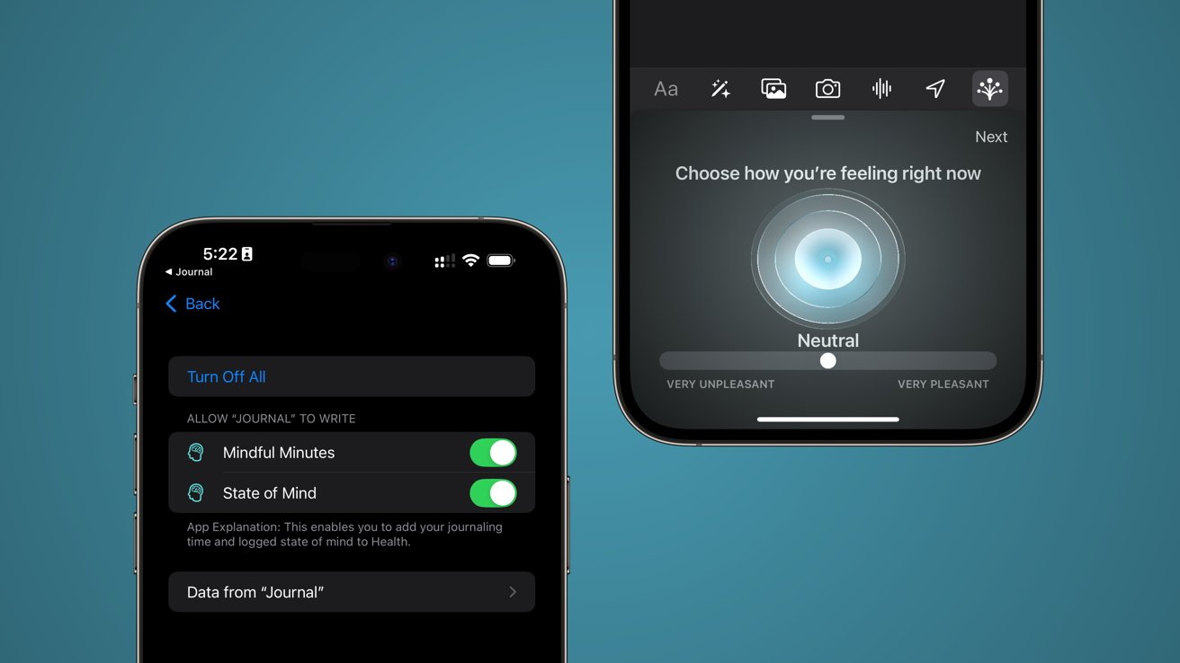
iOS 18 review: Log mindfulness minutes and mood straight from the Journal
The Insights screen provides various metrics like streaks and total word count. Streaks are a significant motivator for keeping up a healthy journal habit, and they are a welcome addition to Apple’s app.
Streaks do require the user to actually put an entry in every day or every week. Backdating entries won’t artificially complete a streak.
I can see I’ve got an entry for every day since Journal was released in October. As the time of publication, I have a 35-week streak, but my longest daily streak is 44 days because I backfilled some entries.
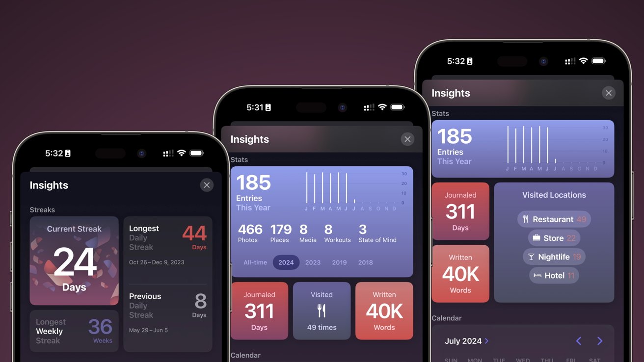
iOS 18 review: Journal now tracks your streaks and other metrics
I also have more days journaled than the app has been available because I’ve manually entered some entries from Day One going back to 2018.
I’m excited to keep journaling with Apple Journal. It will be easier than ever, thanks to new widget options and metrics.
It isn’t a perfect app yet, but it has a bright future as long as Apple doesn’t forget about it. I’d love to see third-party apps suggest entries and for the app to be more proactive in generating automatic entries based on available data.
Messages
Apple’s updates to Messages continue the trend of offering users options, whether they want them or not. Tapbacks got a big upgrade, and there’s a send later option, but everything else will likely be used by a select few.
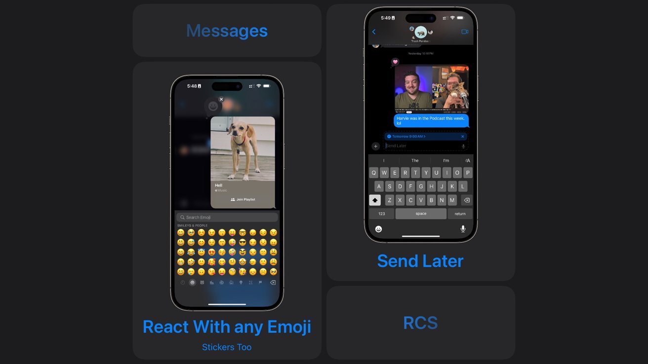
iOS 18 review: Send Later and emoji reactions in Messages
Tapbacks were previously limited to a set of colorless reactions, but now they’re able to be any emoji. It’s a simple system that utilizes the existing interface, so users will likely have an easy time adapting.
Send Later is an excellent option for power users, and it is available in the app drawer. Simply write the text and select a date and time within the next two weeks.
Formatting texts and text effects look like interesting options, but they’ll likely suffer the same fate as previous text effects. Few users will know they are there, and you’ll have at least one aunt who overuses them.
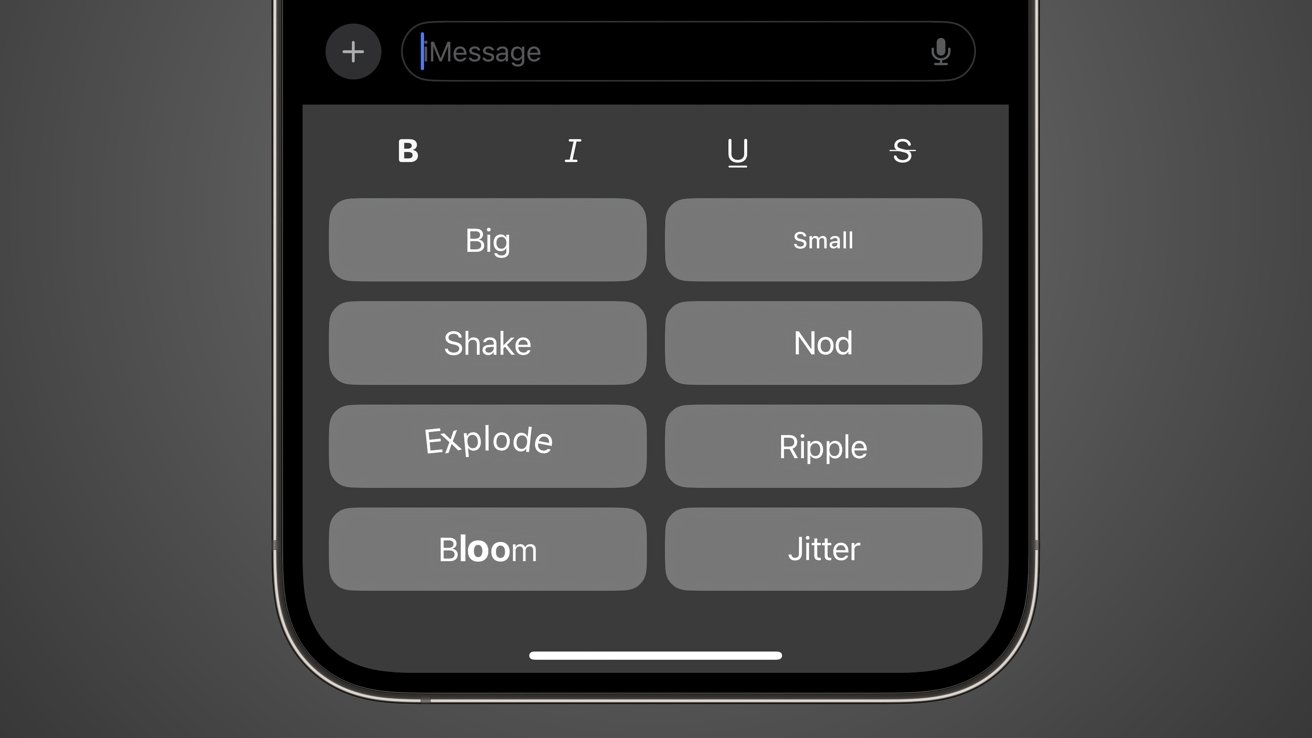
iOS 18 review: Text Effects can be applied per word in an iMessage
Effects like jitter, shake, and explode are fun. I’m interested in seeing how these get adopted outside of nerd audiences. The text effect section is prominent in the suggestions bar below the text box, so it may mean users will discover it easier than a long press.
The biggest update to Messages had the least time on screen — RCS. Green bubble texts with compatible users on compatible networks will be upgraded from SMS to RCS.
The upgrade allows for typing indicators, high-resolution images and videos, and tapbacks. The implementation is in its early days, and we’ll have to see what the iOS 18 launch looks like to understand the implementation fully.
Notes
Apple Notes got two significant updates — math notes and voice memos. Math notes on iPhone isn’t quite as impressive as it is on iPad, but it still works when typing out equations.
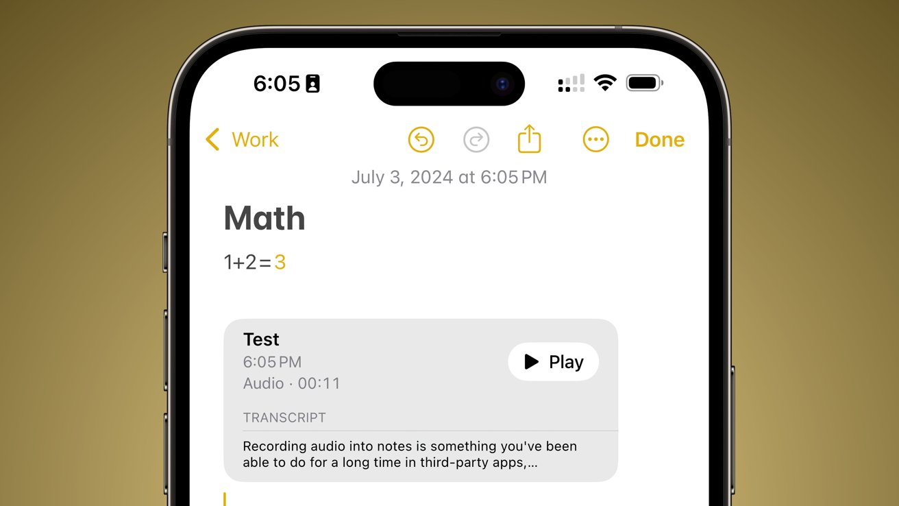
iOS 18 review: Equations can auto-populate answers and voice recordings are transcribed in Notes
Integrating Voice Memos into Apple Notes enables users to record audio while typing into their notes app. It is a feature that’s been around in many third-party apps for years.
However, Apple takes it a bit further by automatically transcribing audio and making it searchable. Users can also take the transcript of the voice memo and add it to the note as text.
The update overall is minor in scale. It does elevate the Notes app so users can rely on Notes instead of third-party options if all they need is voice recording and transcription. But power users will likely still need other apps.
Calendar
Another seemingly minor but elevating update brought Reminders to Calendar. It is a simple integration with the ability to create, view, and manage Reminders in line with Calendar events.
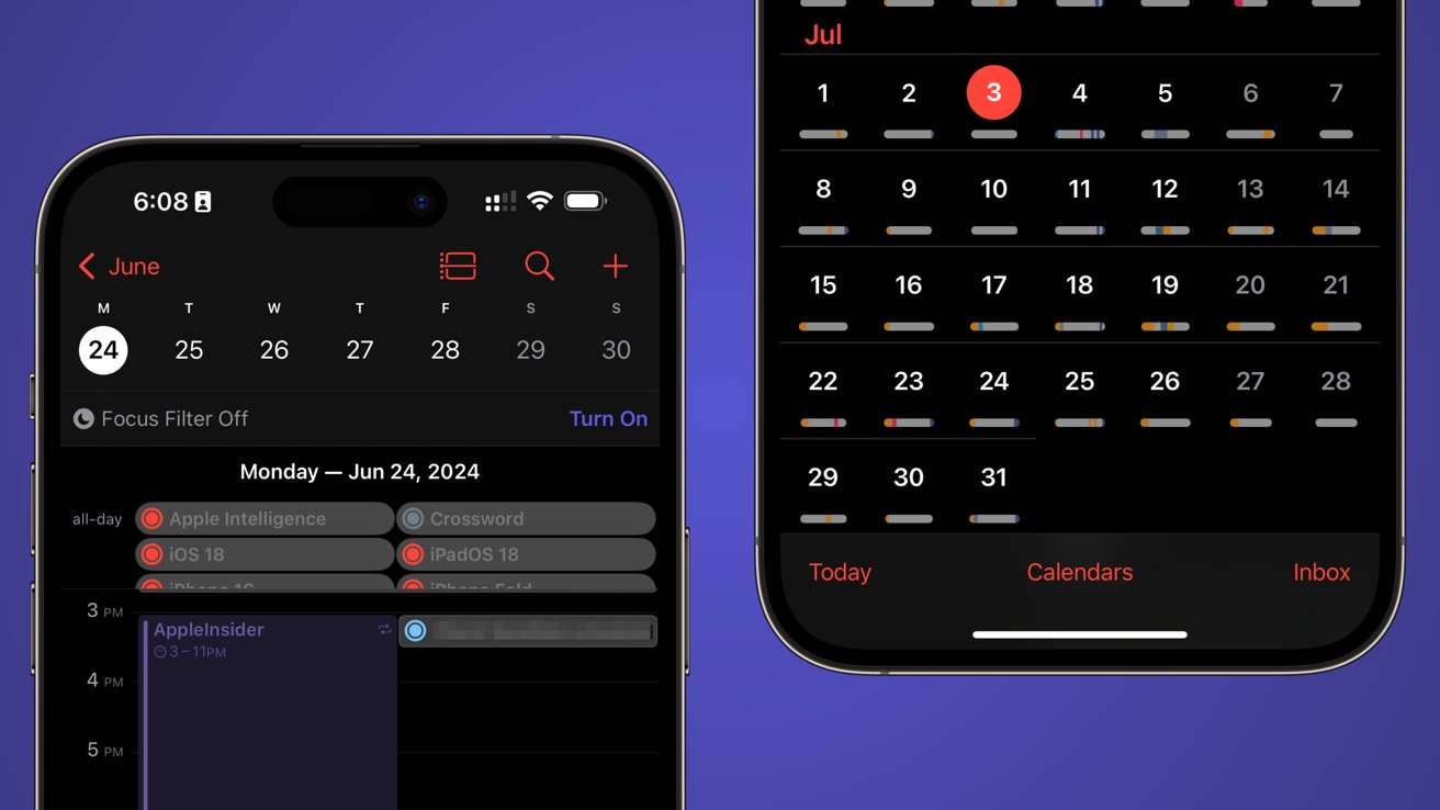
iOS 18 review: Reminders now appear in Calendar
It isn’t anywhere near as complex as Fantastical’s integration or other third-party apps. However, like with the Notes updates, it may be enough to convince some users to stick with Apple apps, as they are “good enough.”
There are several views available, like stacked or compact bars in the month view. The single-day view crams Reminders into a tiny scrollable interface at the top, which isn’t ideal if you have a lot of reminders in a day.
Apple does offer a list view, which makes managing multiple Reminders alongside Calendar events more viable. However, at that point, you may just want to go back to the Reminders app.
Power users won’t be coming back to Apple Calendar, but I’m happy to see Reminders integration. Hopefully, Apple will continue to add such cross-app features in future updates.
Everything else
There is a lot in iOS 18 that are smaller updates and features that I’d still like to call out here. As I said earlier, there is quite a lot here, even without Apple Intelligence available to discuss.
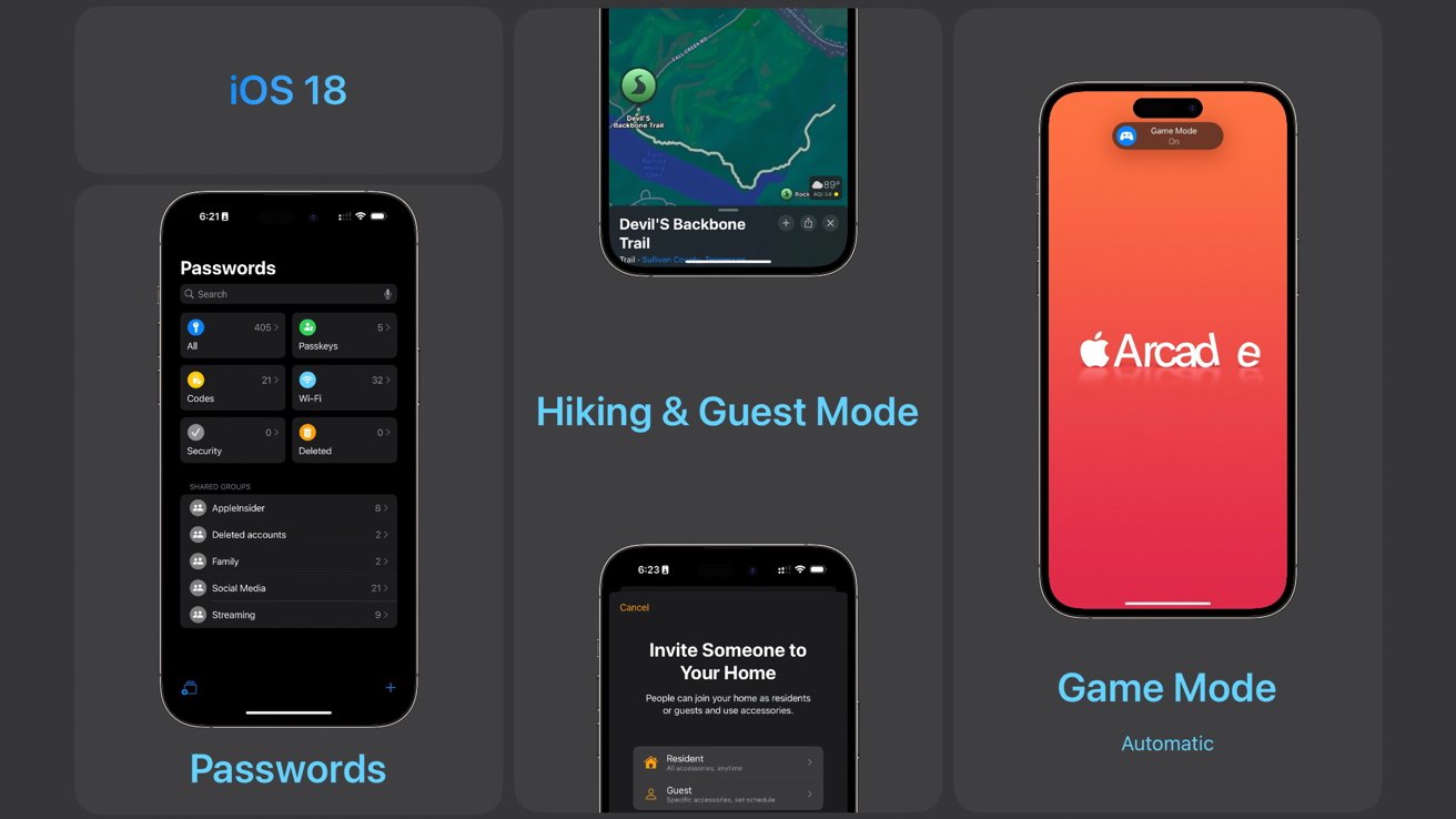
iOS 18 review: Passwords, hikes, guest access, and game mode
The Password app is a big finally for iOS 18. There’s not much to it if you’re familiar with the password section of Settings, except it includes network passwords and filtering options.
Apple added guest access to the Home app, but I haven’t been able to test it yet. It is an exciting feature that should vastly improve how I handle visitors or pet sitters when I’m away.
Another tiny “Sherlock” is Apple’s addition of hiking routes to Apple Maps. While this feature won’t be as fleshed out as AllTrails, it does provide useful information when at known trails and national parks.
Game Mode automatically turns on when playing a game, but I’d actually prefer to see this as a Focus Filter instead. Maybe you don’t need game mode when playing Sudoku, but if you connect a game controller, it would mean you’re ready for more serious gaming.
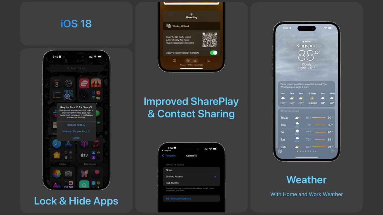
iOS 18 review: Lock and hide apps, SharePlay from HomePod, Contacts privacy, and Home Weather
SharePlay extends to AirPlay and Bluetooth devices like HomePod and Beats Pill. I loved the implementation with CarPlay and am very happy that it is available everywhere now, even for people without Apple Music subscriptions.
The ability to hide and lock apps has been a long time coming. I find it humorous that TikTok decided this was a sign that iOS 18 was a “cheater’s paradise.” It’s just a useful utility, especially if you’re letting a kid use your smartphone.
Apple finally locked down contact sharing in apps, but it feels like a half-step. Users can still just say “allow full access” if they’re in a rush, which solves nothing. Apple should treat contact access as seriously as it does location access.

Coming later this year
It has become tradition for Apple to reveal things at WWDC that won’t be available right at launch. This year, it’s the new Apple Mail categorization feature, which is separate from Apple Intelligence.
iOS 18 review: Apple Intelligence isn’t yet available to test
Mail categorization is something I’ve wanted for a while. Third-party apps like Edison Mail does a great job sorting content, but I’m excited to see Apple do it in a way where I’m certain privacy will be preserved.
The most obvious part of this review that’s missing is Apple Intelligence. Apple’s take on AI may appear in the developer betas in some form later in the summer, but even that isn’t certain.
Apple Intelligence launches to the public as a beta feature alongside the iOS 18 release in September. The Siri upgrades likely won’t be available until spring 2025 if rumors are to be believed.
This is my iPhone
So far, the most significant updates around iOS 18 are tied to personalization and control. Apple Intelligence will undoubtedly step in and take over the conversation in the coming months, but for now, I’m happy to have had a view of the update unclouded by AI.
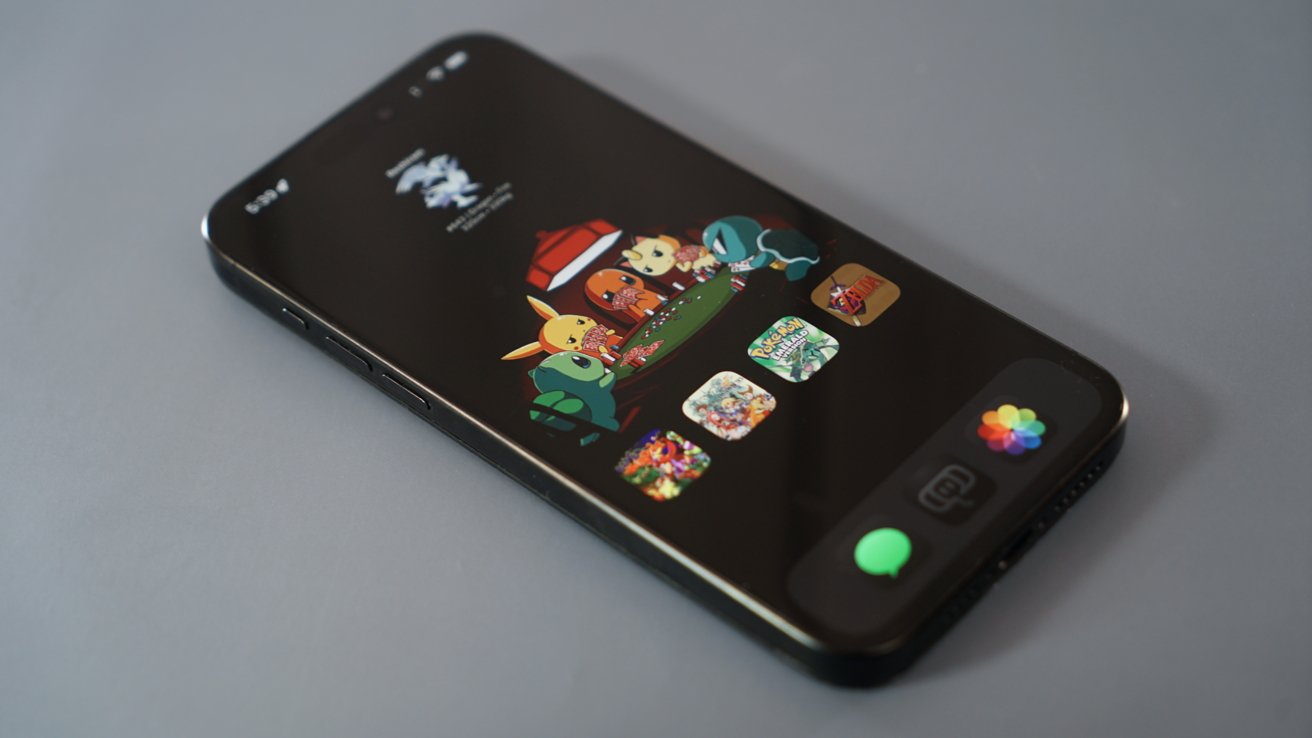
iOS 18 review: get creative with custom icons, blank spaces, and wallpapers
Part of what makes an iPhone personal is the ability to customize it top to bottom with the way it looks and behaves given different contexts. iOS 18 has enhanced that further with new control over the Home Screen, Lock Screen, and Control Center.
Apple also made apps more useful with more cross-app functionality, more developer APIs, and better Shortcuts implementation. Safari is smarter, Photos is more personal, and Journal is a much stronger app overall.
I’m excited to see how iOS 18 evolves through the beta period over the summer and how Apple Intelligence affects the operating system as a whole. AppleInsider will revisit iOS 18 as new features become available throughout 2024.
iOS 18 review – Pros
- iPhone is more customizable than ever
- Dark mode icons and no-text mode check off two significant user requests
- Forced dark mode icons for third-party apps means no need to wait on holdouts
- Redesigned Control Center opens up more space for competition with first-party apps
- Messages is better for all users thanks to RCS and Send Later
- Journal is a much better app with streak and Health features
- Apple Intelligence will usher in a new era for iPhone software
iOS 18 review – Cons
- But, Apple Intelligence is available to a very small percentage of the user base at launch
- And, it’s going to take a year for every Apple Intelligence feature promised at WWDC to arrive
- Icon tinting will need some work and support from developers to be useful
- Jiggle mode is still a mess wherever it is used
- Photos redesign may offer more customization, but it may prove difficult to adapt to for many users
Rating: 4 out of 5
It is clear Apple had an internal focus on Apple Intelligence while developing iOS 18. It is an overall smaller release compared to previous years, but the included features make up for lack of volume.
Even when considering Apple Intelligence, the score wouldn’t improve much since a very small percentage of the user base is getting access. Of the 24 compatible models, only 2 get the advanced features.
iOS 18 release date & compatibility
Apple will release iOS 18 a few days before the iPhone 16 is launched in September. Every device that can run iOS 17 is getting iOS 18.
The following devices can be updated to iOS 18:
- iPhone 11
- iPhone 11 Pro
- iPhone 11 Pro Max
- iPhone 12
- iPhone 12 Pro
- iPhone 12 Pro Max
- iPhone 12 mini
- iPhone 13
- iPhone 13 Pro
- iPhone 13 Pro Max
- iPhone 13 mini
- iPhone 14
- iPhone 14 Plus
- iPhone 14 Pro
- iPhone 14 Pro Max
- iPhone 15
- iPhone 15 Plus
- iPhone 15 Pro
- iPhone 15 Pro Max
- iPhone SE (2nd generation)
- iPhone SE (3rd generation)
- iPhone XR
- iPhone XS
- iPhone XS Max
There will be more to say about iOS 18 once Apple Intelligence begins rolling out to beta testers. Stay tuned to AppleInsider for extensive coverage of Apple’s first attempt at AI.
Where to buy an iPhone to run iOS 18
Wireless carriers are offering aggressive incentives on iPhone 15 devices in anticipation of the iPhone 16. You can jump straight to the offers from the carrier of your choice below — or head over to our iPhone deals roundup to compare promotions across retailers.

