Apple’s macOS Sequoia is chiefly a tale of two halves, with all of the better improvements coming later. But what’s here now is good, sometimes even very good, but it definitely doesn’t feel like the full picture.
Every year Apple brings out a new macOS and it tends to follow a similar pattern. At first you notice some visual differences and some small improvements, but in those first hours of use you’re not sure it was worth the upgrade for anything other than security reasons.
Shortly after those few hours, though, there is a cumulative effect where all of the little changes and benefits become at least subconsciously apparent. It’s subconscious because you only truly notice when you try to go back to last year’s macOS.
Then, every time, last year’s version seems peculiarly old and even out of date. Sometimes you even wonder how you managed to get any work done with it.
That is the case with macOS Sequoia and after no more than a day with it, you won’t want to go back to macOS Sonoma. Unless, that is, your apps don’t work with the new OS.
Whether you’re tempted to upgrade or not, before you even consider what’s worth moving to macOS Sequoia for, check your apps. There will be apps, even major ones, that are not yet updated for macOS Sequoia and in that case it is never worth the upgrade.
There are exceptions to this annual subtle update, of course, with the major one being the move to macOS Big Sur in 2020. That was a gigantic change and while you still had to check your apps, it was an obvious upgrade.
It was an obvious upgrade that, like every release before or since up to now, was followed by a whole series of point updates, taking it from macOS 11 to 11.1 and so on. Every macOS goes through these and usually you don’t even need to know what the differences are, what the improvements are.
This year, though, you already know. This year, the macOS point updates are going to bring Apple Intelligence, and do so in stages.
Apple has not fully committed to the stages yet, and deadlines for them all may slip. But at present, it’s believed that the significant updates will be in October 2024 and early 2025.
iOS 18.1 in October 2024
- Writing Tools
- Clean Up tool in Photos
- Audio recording and transcription in Notes and Phone
- Summarized notifications
- Smart Reply in Mail
- Priority Messages in Mail
It’s possible that Image Playground — Apple’s generative AI image creator — may be included in the October release. But it hasn’t been in the beta releases for iOS 18.1, so it’s likely that it will come later.
The October release is also specifically for US English. Further stages, starting in December 2024, will see the above coming to English-speaking countries including Australia, Canada, and the UK.
macOS Sequoia review — not finished yet
By the time next year’s macOS is released, Apple Intelligence will presumably be fully here and the difference between macOS Sequoia and macOS Sonoma may even appear huge in retrospect. But until then, it’s confusing to know what Apple Intelligence features are coming when, so it’s confusing to know what you have or haven’t got yet.
The confusion isn’t helped by how Apple Intelligence will not be some specific feature that you turn on, or that you launch like an app. Instead, Apple Intelligence will seep into everything.
Which for the future will surely be good, but for right now with the first release of macOS Sequoia, it makes for a rather hollow update.
Apple has been quite clear about when it plans to roll out some parts of Apple Intelligence, but the waters are also sometimes muddied. That’s most apparent on the iPhone where Siri has yet to receive its promised Apple Intelligence major update, but it does have the revamped “glowtime” animation that makes it look new.
The Mac has no such visual changes. There is nothing in macOS Sequoia that reveals how there is much more to come.
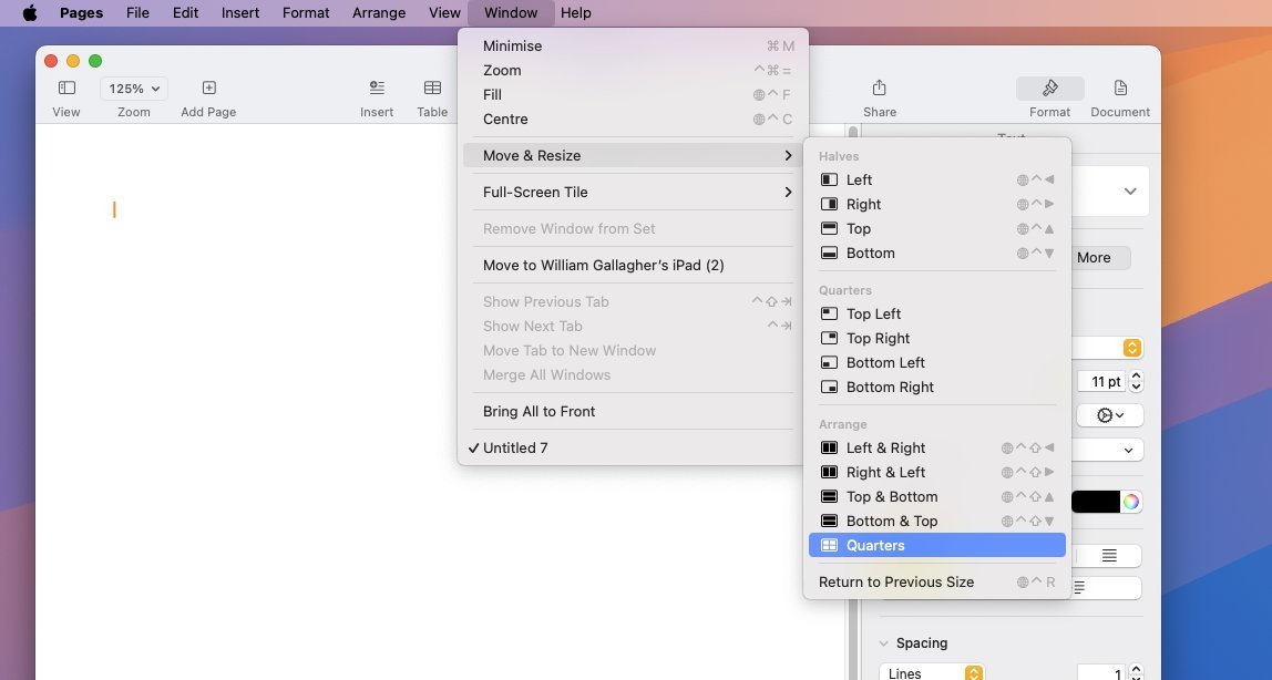
Apple has added window tiling to macOS Sequoia
So this is the first macOS review where there really has to be a sequel. If a review is to encompass what is really new and improved, if it’s to be a record of how the Mac is progressing, then it’s going to have to be updated toward the end of macOS Sequoia’s life.
But for now, with it being devoid of its main feature, macOS Sequoia does still bring a lot to the Mac. It tends to be small features, small updates, but if you update in order to stay on the most secure new version, you do also get features that you will use.
You do also get features that will make you wonder how you got by on previous versions of macOS. Just don’t expect the features to be gigantic or startling.
macOS Sequoia review — Window tiling
One of the few visual changes to the Mac is one that you might not even seen — because it’s visual only when you’ve turned it on in Settings. It’s called Window Tiling and the short version is that Apple has been out copying.
Its definitely been inspired by Windows, which has had a similar tiling feature for perhaps decades. In Apple’s implementation, as you drag a window to the top or sides of the screen, it can then snap to fill precisely half of your display.
The window can be automatically expanded to fill the left or right half of the screen, it can be expanded to fill the top or the bottom. And it can go full screen without actually going into what Apple previously called full screen.
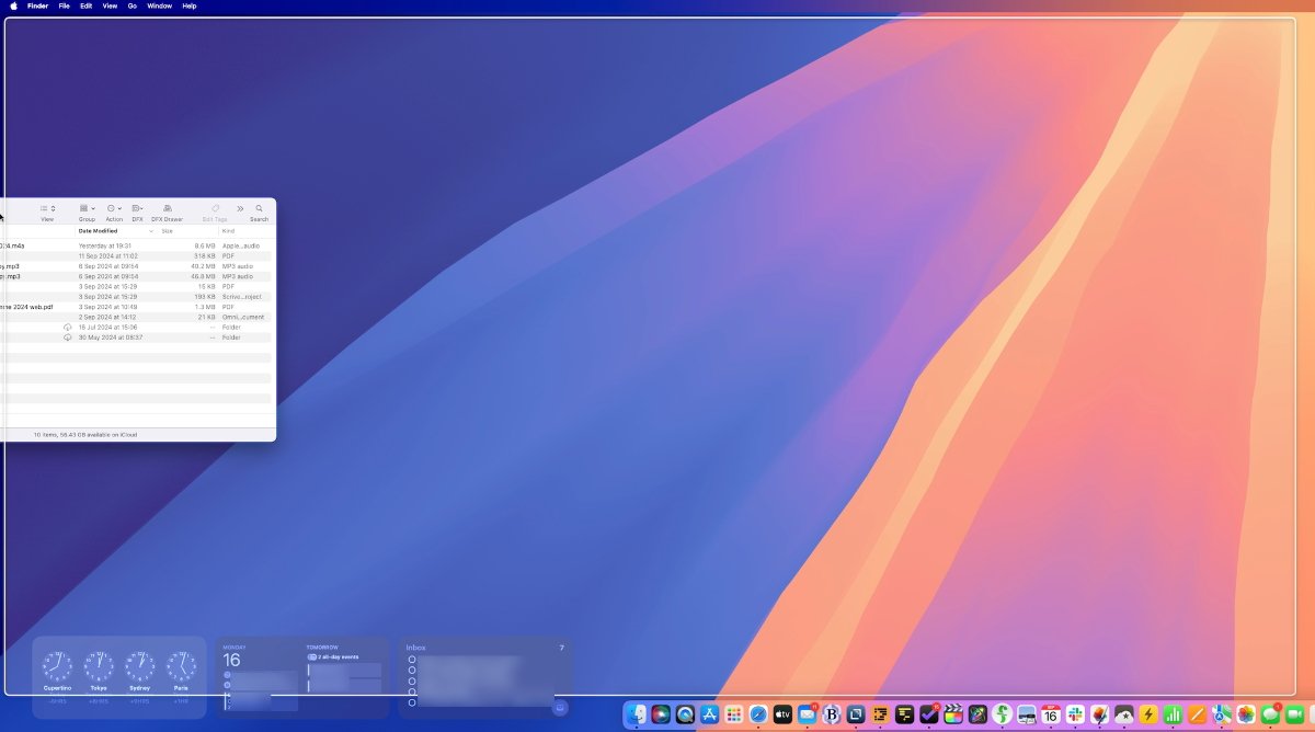
It’s hard to see in a still image, but even dragging a Finder window to the side of the screen makes the Mac show a large white border. Click to let go, and the window will expand to fill it.
That previous version — which is still available when you click on the green traffic light icon at the top left of any window — is a pain. It fills the screen, to the extent that it even hides the menubar, and that’s great for concentration, but ridiculously fiddly for when you want to change apps.
Or even to just open a new document, since all of the menu controls are hidden.
With macOS Sequoia’s Window Tiling, you can have one app take up the whole screen but not so much that it hides the menubar.
Click on that green traffic light icon, but keep pressing. A menu of icons pop up that includes options for making the current window full screen. The same menu allows for the window being resized and repositioned to the top and bottom, left or right.
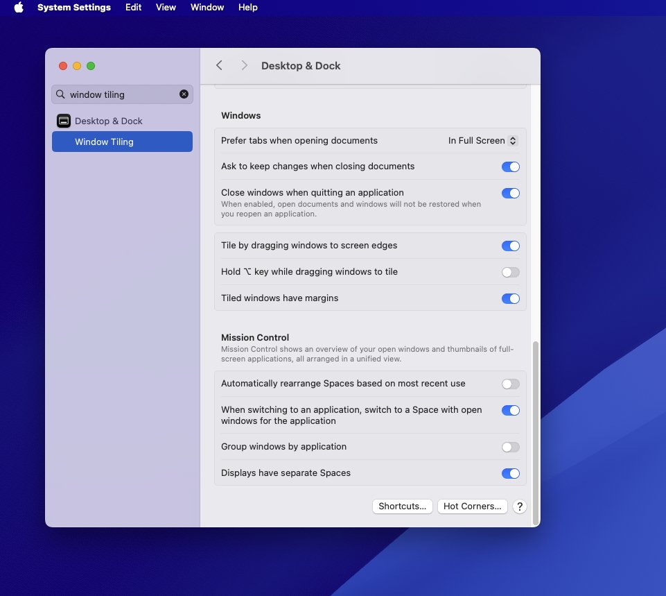
Window Tiling is an option buried in Settings, but useful once you turn it on
Those options are also available when you just drag an image to the side of the display. Once your cursor reaches the side of the screen, macOS Sequoia shows a pale white window that represents just where your actual window will move to if you let go.
Very nicely, if you move the window and it snaps to, say, full screen, you can drag it away again and it will revert to its previous size. That’s especially useful when you’re working with, say, Safari and are breaking out tabs into separate windows.
The action of clicking and dragging a tab out to a new window takes you perilously close to the point where the Mac assumes you want to tile the windows. So being able to pull it back with a click and a grumble is good.
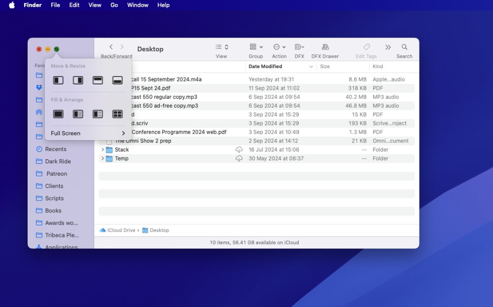
Every window, including Finder ones, now has window tiling options built in
If Windows has had this forever, though, so has the Mac — through third-party apps. This is either a case of Apple Sherlocking a whole fleet of apps, or it’s a case of Apple spotlighting this class of functionality.
There will be users who have never looked to find apps like Moom. There will be users who have never thought about where windows and documents go, they just know that they go where the user puts them.
Once a user has seen tiling, though, and knows it’s possible, perhaps third-party alternatives will benefit. There’s no question that Apple’s implementation in macOS Sequoia is good enough that most people will be satisfied with it
But the odds are that those people are ones who would never have conceived that there could be a better way of handling multiple windows. The odds are that these are people who would not search for a third-party app because there’s no reason for them to think of it.
There is plenty of frustration over window management, though. Users who have found third-party apps for this are unlikely to switch back.
And Apple really doesn’t help itself here. Window Tiling genuinely helps with managing a lot of documents on screen at once, but on past record, Apple is likely to forget this feature even exists.
Arguably it’s forgotten Stage Manager, at least on the Mac, which was the previous attempt to solve window management problems. It’s definitely forgotten Spaces, which was the solution before.
But wherever it was copied from and however much third-party alternatives will offer more features, Window Tiling is a new option in macOS Sequoia. It’s also fully and entirely a Mac feature — unlike most of the rest of the update.
macOS Sequoia review — iPhone mirroring
Last year Apple made it possible to use iPhone widgets on the Mac, in a move that was clever but ultimately pointless. Yes, even if you don’t have the equivalent Mac app, you could have the iPhone widget — but it typically did nothing more than say “open the iPhone app.”
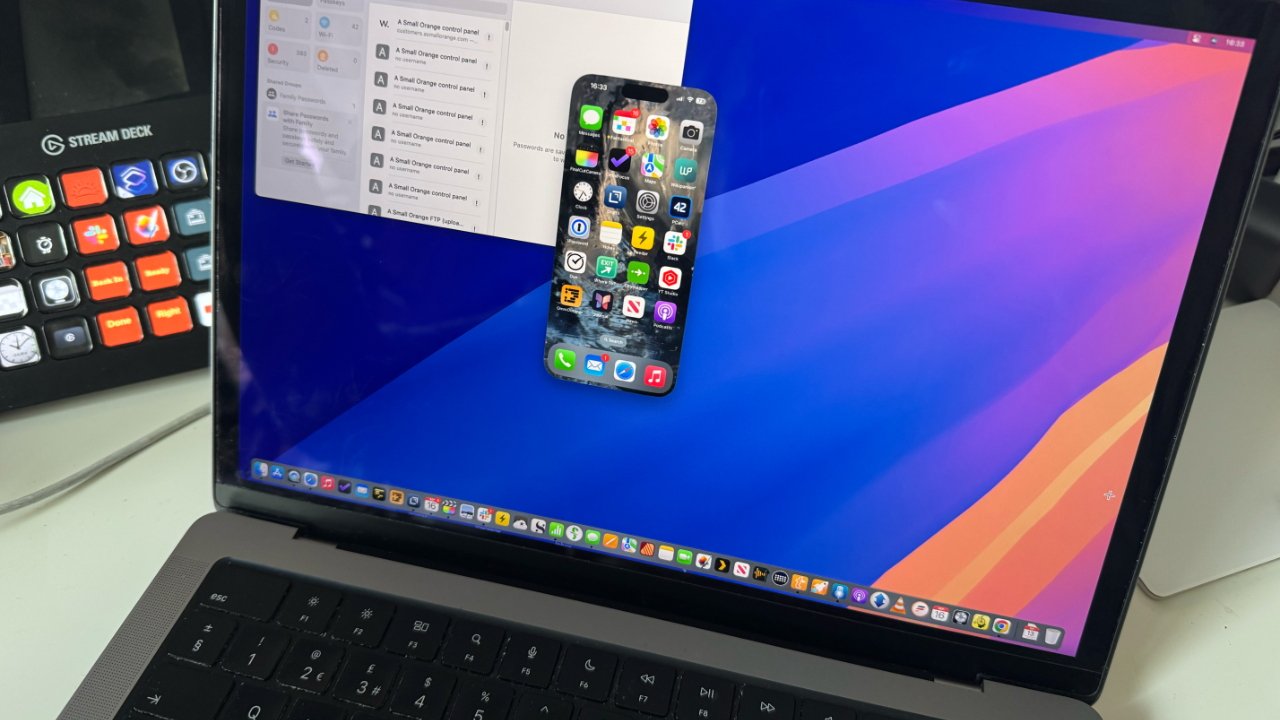
Now you can have your iPhone on your Mac and this time, it works very well indeed. There are limitations, but right there in the Dock of macOS Sequoia there is a new iPhone mirroring app, and it just works.
Sometimes there are hours — or there were during the beta test — where it wouldn’t work at all. But most of the time it would be instant and flawless.
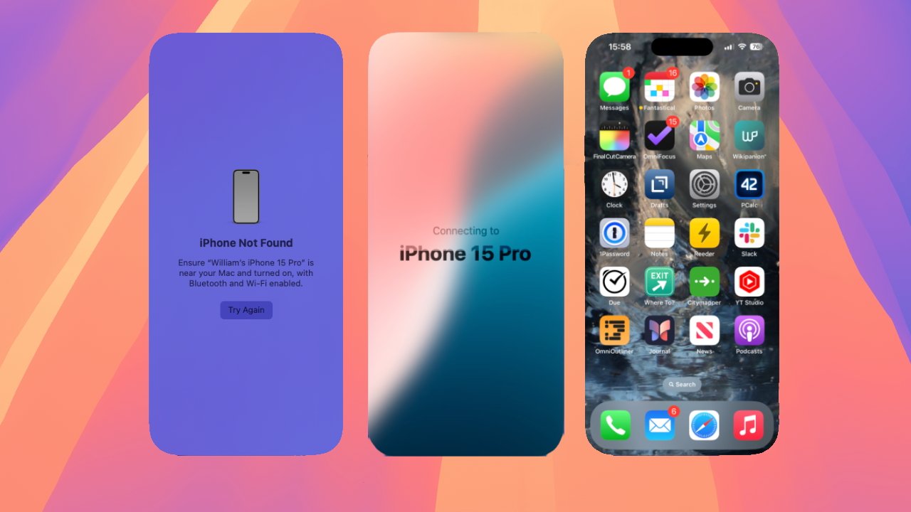
Sometimes iPhone Mirroring just won’t work, but usually it starts and connects very quickly
Click the Dock icon and your iPhone’s screen would open on the Mac. Apple has made it so that you can see that screen at actual size, or increase it.
There are limits on what you can do — you can’t, for instance, sign in to an app that requires Face ID. But you can open apps, you can control the phone as if it were in your hand.
The phone does have to be reasonably near by so it can seem peculiar to not just pick it up in your actual hand. But in practice, you find that you do keep using it — and sometimes you keep leaving it open all day.
That’s because at times there are apps on the iPhone that are better than the equivalent website you might open on the Mac. At times it’s just handy to have that device ready for you to look up things on.
Whatever the reason, you do end up using it far more than you might imagine. And that makes this perhaps the stand-out feature of macOS Sequoia.
macOS Sequoia review — Passwords
Your mileage will vary, but the convenience of having your iPhone on the screen whenever you need it, arguably outweighs the convenience of Apple’s other new app. Passwords is now an app instead of a feature within Safari.
Which is good, but at first seems downright peculiar. You will be used to Safari offering to autocomplete logins for you — and you may be used to Safari and third-party password management apps both trying to fill the form out for you.
That’s less prevalent now, for some reason, but just taking the password autofill out of Safari and into its own app has an unexpected benefit. You can still enter passwords while in Safari, but if you go via the Passwords app, you will be surprised just how many passwords you’ve got in there.
Right out of the box, Passwords opens up with — of course — any current password that Safari has. But it also seems to have retained every password you’ve ever hard.
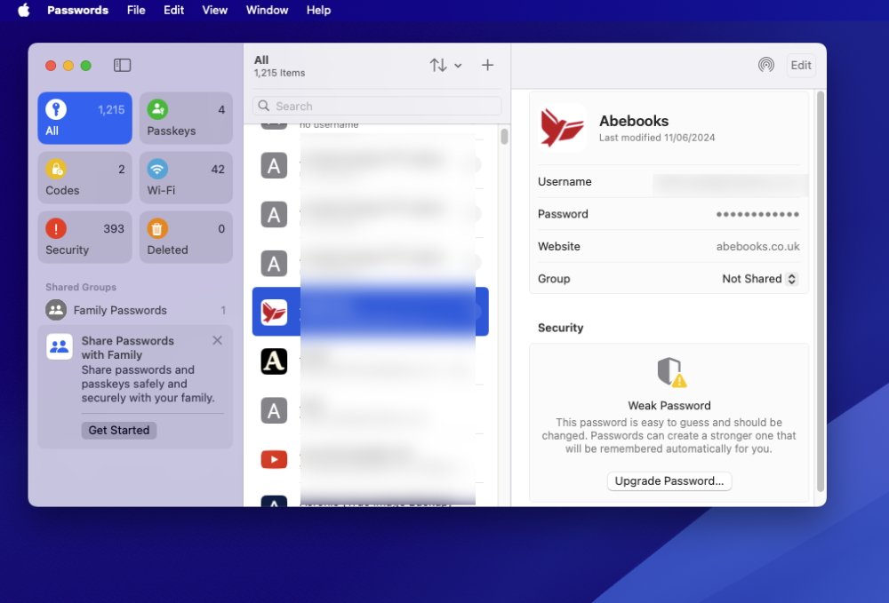
Apple’s new Passwords app
The app will display passwords for routers you’ve forgotten ever owning, for instance. It will have accounts you haven’t used in a decade.
Before you do anything else with it, Apple’s new Password app will be replete with entries. And that’s before you even look at importing entries from any third-party password management apps you might have.
The makers of those apps are another set who have to hope that Apple adding this will shine a spotlight on how great a feature password management is. And again, there will be people who use this Password app who would not even have thought to find out if there were third-party ones.
After all, if you don’t happen to know about password management, there’s little to tell you about it. You can just carry on getting frustrated at having to create and remember passwords yourself.
It’s likely that the very existence of this new Passwords app will by itself make more users be more secure on their Macs. So that has to be a great thing, even if it makes life harder for third-party firms.
Those firms do still have advantages, though. Passwords is good for, well, passwords, so it’s fine for your logins. It will even support certain verification codes.
But unlike all third-party alternatives, it will not let you store anything else. No app serial numbers, no bank account details, no credit cards, and no secure documents.
You can bet some or all of this is coming in next year’s macOS update, but it isn’t here now.
macOS Sequoia review — Safari gets better
It’s at least good that, for whatever reason, the rival password apps don’t seem to fight each other so much in Safari. You used to sometimes have to guess which one you were using, Safari’s own or your third-party app, to enter a login.
Safari is also better in a lot of subtle ways, but this is somewhere that the lack of Apple Intelligence is both apparent and frustrating.
Right now, macOS Sequoia users do get two clear benefits. One is the ability to hide distracting items, just as you can on the iPhone.
The other is Reader view. This is the option where instead of seeing a web page, you can elect to just see the text from it, plus the major images.
What you get to see varies depending on the website, but the point is to let you read articles without all of the distractions of some messy sites. If a site doesn’t manage to block Reader view, you do always get a much easier read — but it can leave out elements and you simply don’t know what you’re not seeing.
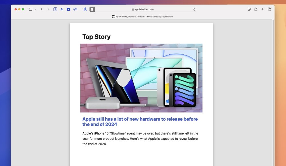
Reader view in Safari has more options but is just generally a nicer read
It’s hard to define, as yet, just what is better with the new version of Reader. It does offer some finer controls for altering how text is shown in Reader view, but really it’s just that it’s better designed.
Subjectively, the new Reader view is just a more pleasant read.
It can’t now, and probably never, can be certain to show you a website’s full text, though. You still need to switch Reader view on and off as you read on but want to check that you’re not missing anything.
macOS Sequoia review — What you’re really missing
As yet, though, you are definitely missing a lot across the whole of macOS Sequoia. By this time next year, there will be so many improvements that it will feel like a whole new macOS release.
Just within Safari, for instance, there will also be Safari highlights. Instead of turning on Reader view to quickly look through for details you need, Safari itself will pull out key information.
The example Apple keeps using is to do with hotel bookings. In that case, just opening the website lets Safari offer you the address and phone number of the venue.
There are going to be hundreds more applications for this across thousands more types of websites, but we won’t know until later.
Then there will also be the promised updates to Siri, but perhaps we won’t ever know that. While Siri is key when you’re using the iPhone, it seems less so with the iPad, and least so of all with the Mac.
Nonetheless, you can use Siri on a Mac and it will reportedly be greatly improved when Apple Intelligence comes.
macOS Sequoia review — The new macOS for now
Don’t wait for Apple Intelligence. Do wait for a few days, at least, to see if there are any major problems.
Despite all of the internal testing and then despite all of the beta tests, things change when you release an OS to the entire world. Let the entire world check it out for you.
And then without fail check that at least your major apps will all work with macOS Sequoia. They’re very likely to, as this is not as big an update as some previous ones like Big Sur, but you have to know.
Then update, work with macOS Sequoia for a day. And then try going back to macOS Sonoma.
It’s impossible not to be disappointed with this initial release of macOS Sequoia since seemingly so much is yet to come. It’s impossible not to think that until Apple Intelligence changes everything, this is a quite small macOS update.
macOS Sequoia review — Compatibility
The official Apple list of what Macs will run the new macOS Sequoia is:
- iMac 2019 and later
- iMac Pro 2017 and later
- Mac Studio 2022 and later
- Mac mini 2018 and later
- Mac Pro 2019 and later
- MacBook Air 2020 and later
- MacBook Pro 2018 and later
However, it’s unclear yet just how well some of these will run it. There are Intel Macs in that list and it is certain that they will not support anything that requires Apple Intelligence.
So it could be that some of these Macs will just support what we have now, in this initial release of macOS Sequoia. But it may also be that elements such as the window tiling won’t be supported.
It seems unlikely that the iPhone Mirroring feature will be supported on every one of these Macs, either.
If that seems like Apple pushing users to upgrade, then perhaps it is. But in this case, there are technical reasons why the Intel Macs can’t support some of this, even down to them simply not being fast enough.
Maybe you could wait until Apple Intelligence is here before you upgrade to macOS Sequoia. But if you are still on an Intel Mac, the move to Apple Silicon will shock you with how much better and faster it is.
By this time next year, we may also be seeing macOS Sequoia as an extremely significant upgrade. But for now, it’s like it’s a little hollow, yet those improvements we can see are worth updating for.
macOS Sequoia review — Pros
- Window tiling
- iPhone mirroring
- New Passwords app
- Safari reader mode update
macOS Sequoia review — Cons
- No Apple Intelligence yet
- Few new features for now
Rating: 3.5 out of 5
This feels like a harsh rating since what Apple has brought with macOS Sequoia is good, and at points even very good. But the whole thing feels stunted without the promised Apple Intelligence.
That’s going to pervade the entire OS, to the extent that solely the addition of Apple Intelligence will radically change macOS Sequoia across the board.


