
Still from the new “Severance” title sequence — image credit: Apple
The designer of the new title sequence for season two of Apple TV+ hit “Severance,” has detailed the many clues and hints in the sequence — even though he doesn’t know what they mean either.
Somewhere around the middle of the 2000s, the television drama title sequence was dead. Just compare Aaron Sorkin’s “The West Wing” with its 1999 soaring theme and sequence, to the stark title card of Sorkin’s 2006 “Studio 60 on the Sunset Strip.”
The idea was that a sequence lasting up to 60 seconds is a whole minute’s advertising lost. Hour-long dramas have already shrunk from around 55 minutes to around 45 over the decades, every second possible taken out for an advert, so title sequences were an obvious target.
Except a great sequence does so much that they’ve come back. Title sequences used to be a signal to viewers in the kitchen that their show was starting, they used to convey the tone and the style of the show.
They’ve also always been works of art. But now they’re also elaborate, detailed, and even beautiful pieces of storytelling — especially on Apple TV+.
“Silo” has a richly moody sequence with some symbolism around an apple — the fruit, not the company — but “Severance” took it to a new level. And now “Severance” season two has gone even further.
Speaking to the Los Angeles Times, title credits designer Oliver Latta says that the entire sequence has been redone for the new season. But while it is laden with imagery that is meant to signify different aspects of the season, Latta says he actually doesn’t know what’s happening in the episodes.
Latta did visit the set, and was told some key points, but the sequence was designed and completed before he had seen any of the episodes. While he took instruction from director and executive producer Ben Stiller, some of them were far from explained.
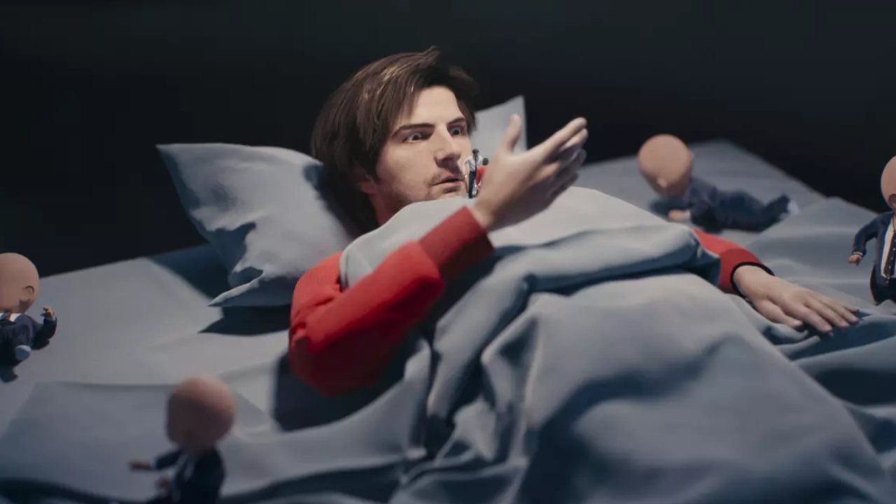
“Let’s add babies,” Stiller is said to have told Latta, but when pressed for why, added only that “I like babies.”
One such baby in the sequence is a crawling toddler version of Lumon founder Keir Eagan, but Latta doesn’t know why. “I have my own metaphor, but I don’t know the actual answer,” he said. “We will see when everything is out fully.”
Animating the sequence
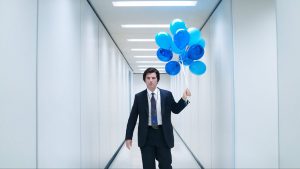
The overall sequence is based on a series of 3D scans of star Adam Scott, who is then taken through nightmare locations including his own brain. Latta says the changing locations are both key to the many plot clues in the sequence, and just his preference as a designer.
“For me, in an intro, it’s great to have contrast in terms of colors and light and also different environments,” he said. “I’m really looking forward to what they see in all these images… I’m being not so direct to leave room for interpretation.”
Originally the sequence did have more locations and environments, but Ben Stiller had it scaled back because it was reportedly spoiling too much.
As well as setting the tone of the show and its darker second season, and as well as being full of plot clues, the new sequence does one more job. It leads the viewer into the episode, and does so with as much of a jolt as possible, showing Adam Scott’s character trying to pry open his head.
“This image is something I always had in mind and I think it’s visually and story-wise really striking and provoking,” said Latta. It’s also a jump scare, a pretty horrifying way to introduce you to each episode.”
For a much more relaxed, and considerably longer, “Severance” video, watch the 8-hour YouTube remix of the show’s music.

